Fork of Radial Stacked Bar Chart of Personal Electric Usage Data By Year for Account
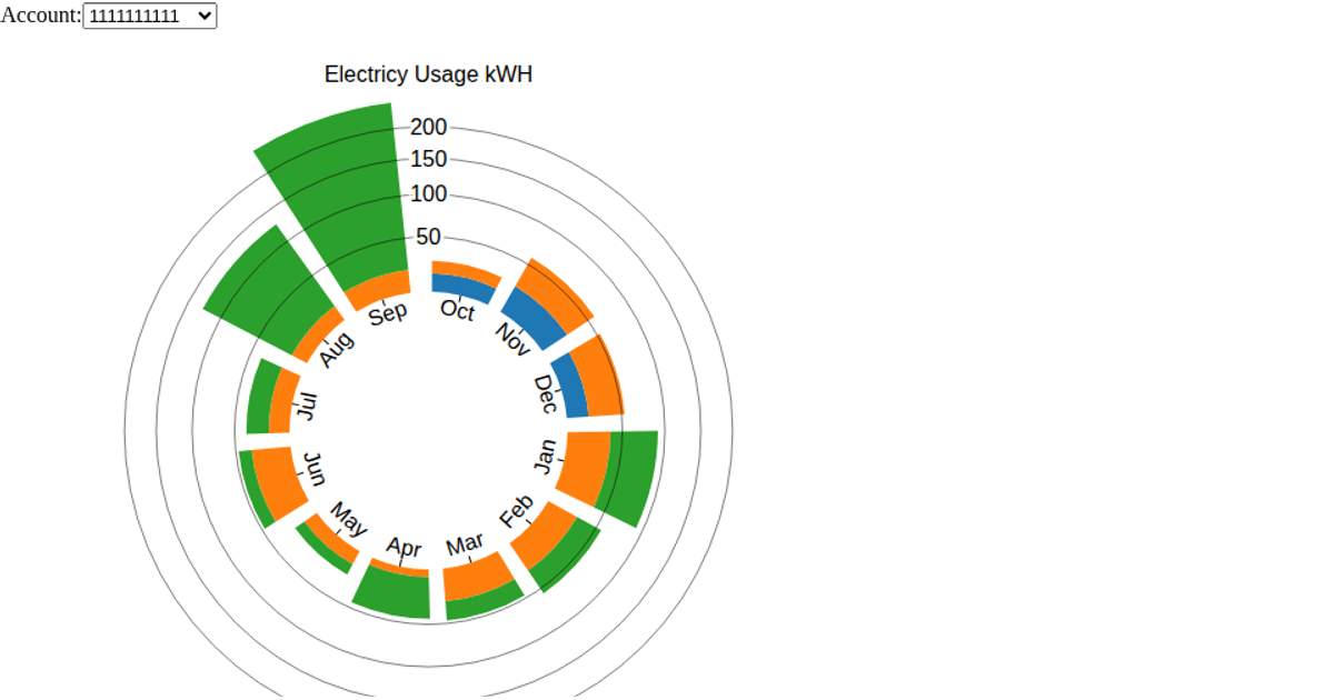
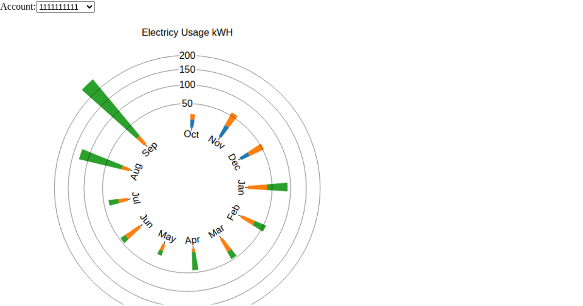
A radial stacked bar chart displays two years of personal electricity consumption for three separate accounts, with each bar segment representing a bill year’s kilowatt-hours for a given month. A dropdown menu switches between accounts, updating the displayed data. The visualization uses d3’s `scaleRadial`, `scaleBand`, `stack`, and `arc` to render the polar layout, with a transition animation on updates. Data comes from a CSV file of electric billing records, and the chart is built as a reusable D3 component with SVG rendering.
AI-generated descriptionA bar chart visualization of my personal electricity consumption dataset. I live in a three family structure and occupy two floors. There is also a common account that supplies the front and back hall lighting as well as the basement and exterrior outlets. It covers a period of two years.
I forked https://vizhub.com/RED98310/a3ea8fbec4b64423a7797a418de4af57?edit=files and stated with that code. I also looked at Most basic stacked barplot in d3.js for how to render the stacked barchart.
I made the following changes from the one last week
- Added the menu to choose accounts.
- Refactored the code into a reusable d3 component.
Next steps
- I still need to get the bar graphs to update. Made progress by getting console.log to work and I can see that update is getting called.
- Wrap the bar graph around a circle that is a 12 month period.




Comments
Sign in to join the discussion.