Fork of Radial Stacked Bar Chart of Personal Electric Usage Data By Year for Account
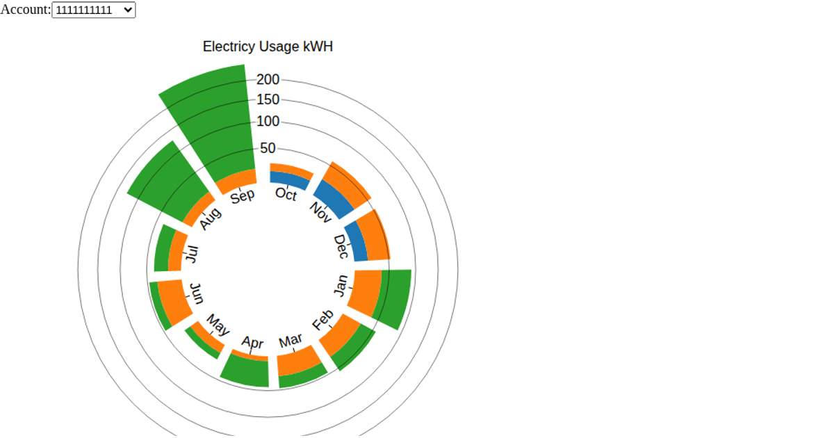
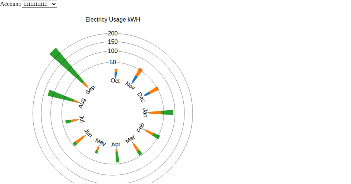
This radial stacked bar chart visualizes two years of personal electricity usage across multiple accounts in a three-family structure, with a dropdown menu to switch between accounts and each bar segmented by billing year. Built with D3 v7, it uses `scaleBand`, `scaleRadial`, and `arc` to render the circular wedges, while `d3.group` and `d3.stack` transform the CSV data. The SVG chart updates via a reusable bar chart component when the account selection changes, with hover text showing usage details per segment and total.
AI-generated descriptionA bar chart visualization of my personal electricity consumption dataset. I live in a three family structure and occupy two floors. There is also a common account that supplies the front and back hall lighting as well as the basement and exterrior outlets. It covers a period of two years.
I forked https://vizhub.com/RED98310/a3ea8fbec4b64423a7797a418de4af57?edit=files and stated with that code. I also looked at Most basic stacked barplot in d3.js for how to render the stacked barchart.
I made the following changes from the one last week
- Added the menu to choose accounts.
- Refactored the code into a reusable d3 component.
Next steps
- I still need to get the bar graphs to update. Made progress by getting console.log to work and I can see that update is getting called.
- Wrap the bar graph around a circle that is a 12 month period.




Comments
Sign in to join the discussion.