🌍 Public
Fork of 2015 Internet Users World Map
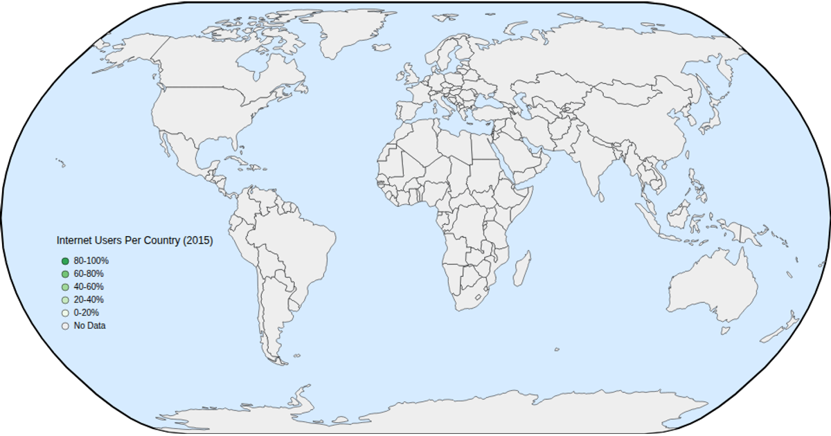
This world map shows the percentage of internet users per country in 2015, using a green color scale to indicate adoption levels. Hovering over a country reveals its exact percentage via a tooltip, and users can zoom into the map to inspect small nations. The visualization loads geographic data from a TopoJSON world atlas via `topojson-client`, projects it with `d3.geoNaturalEarth1` and `d3.geoPath`, and joins user statistics from a CSV file. Zooming relies on `d3.zoom`, while the color legend and interactive tooltip are built with D3 selections and a `scaleOrdinal` scale.
AI-generated descriptionA 2015 world map of Internet Users Dataset. This iteration adds hover and zoom.
MIT Licensed


Comments
Sign in to join the discussion.