🌍 Public
Choropleth Map!
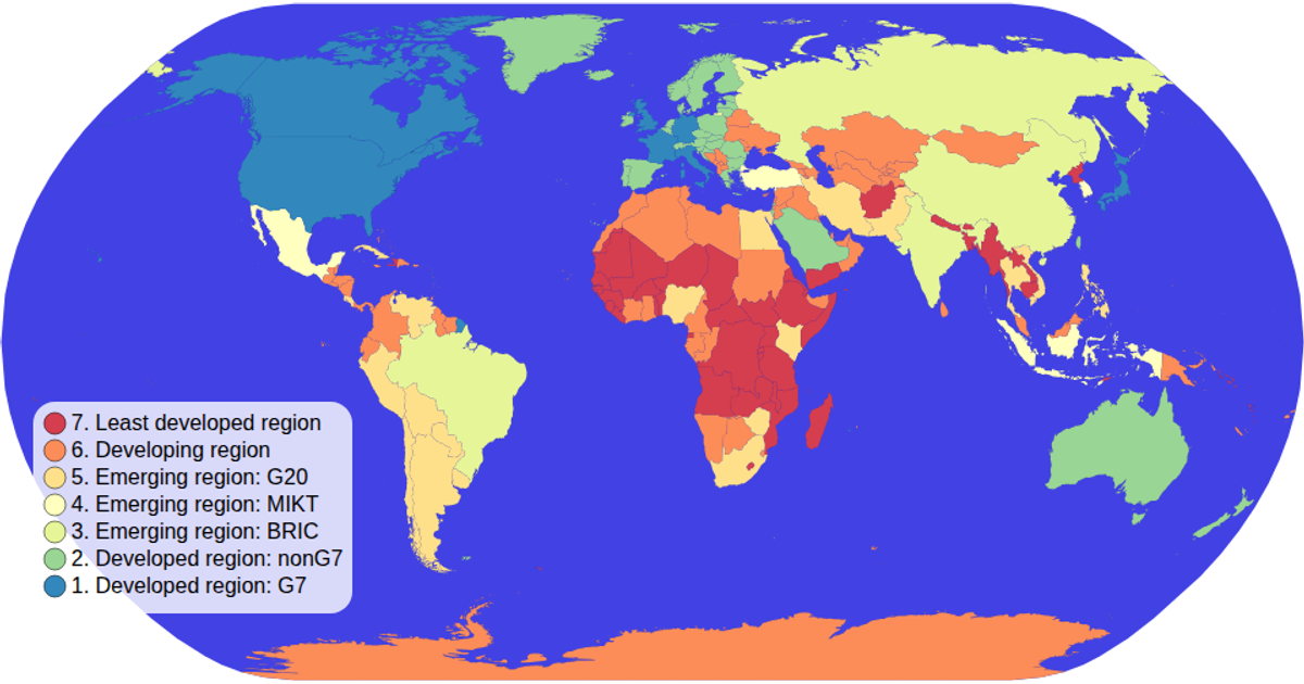
This choropleth map colors world countries by their World Bank economy classification, using a spectral color scale. The visualization renders geographic boundaries with d3.geoPath and a geoNaturalEarth1 projection, while d3.zoom enables interactive panning and zooming. A custom colorLegend displays ordinal values as circles with labels, and country data comes from TopoJSON world-atlas files joined with tab-separated metadata. Hovering highlights individual countries, and tooltips show each nation’s name and economic group.
AI-generated descriptionMIT Licensed




Comments
Sign in to join the discussion.