🌍 Public
lesson 8: Bar chart
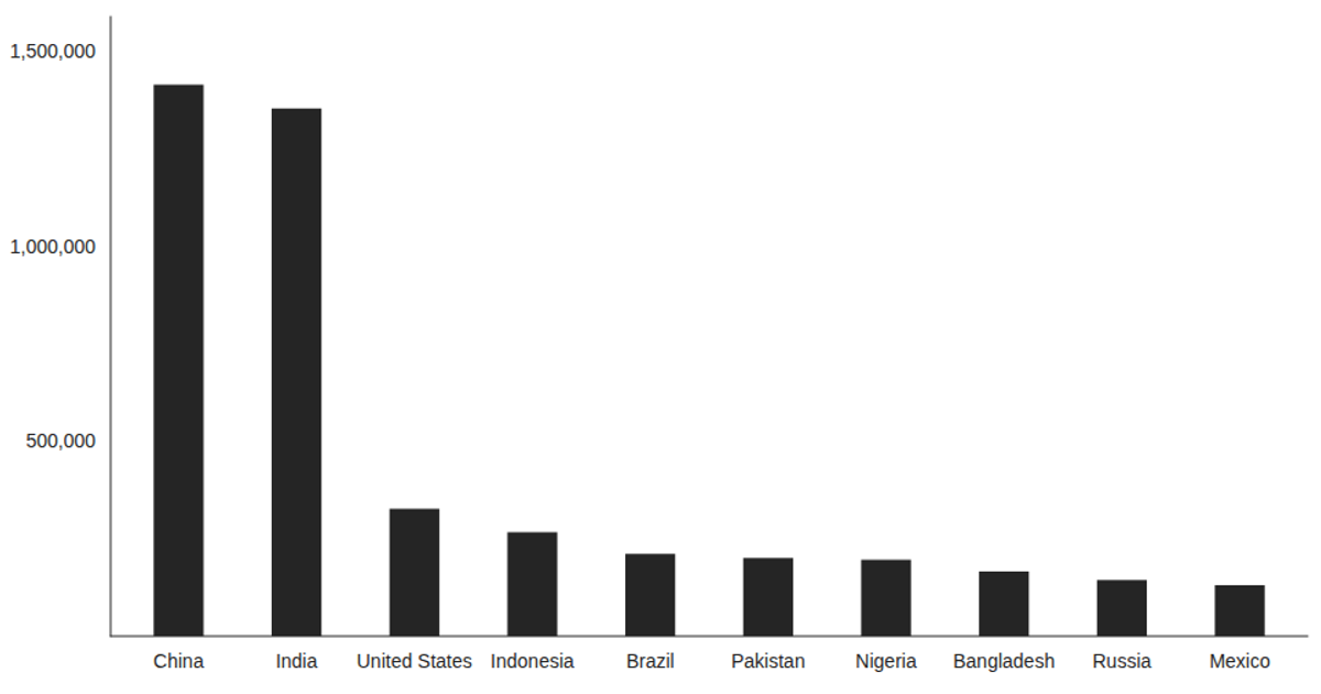
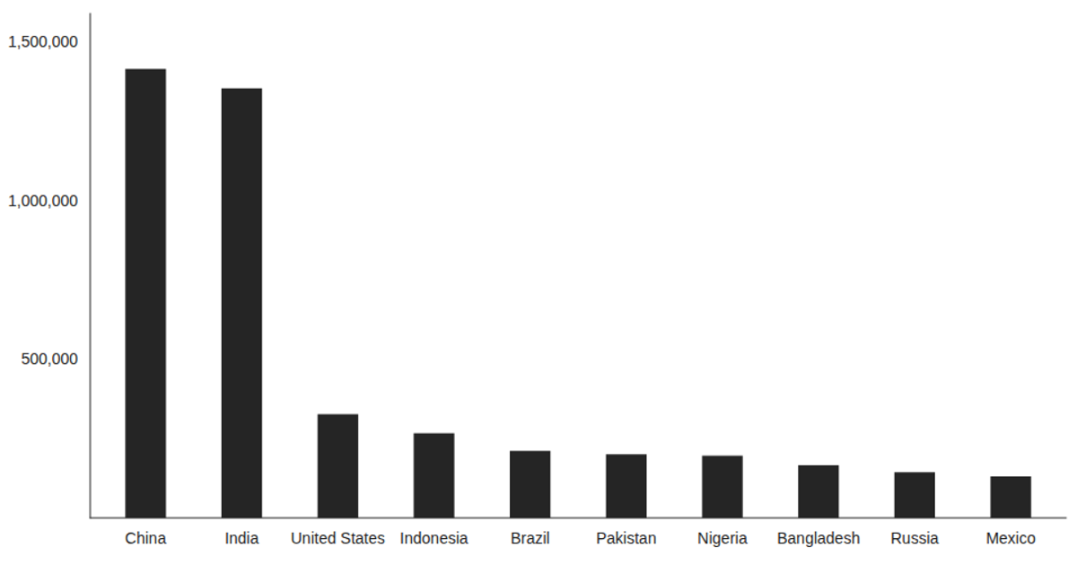
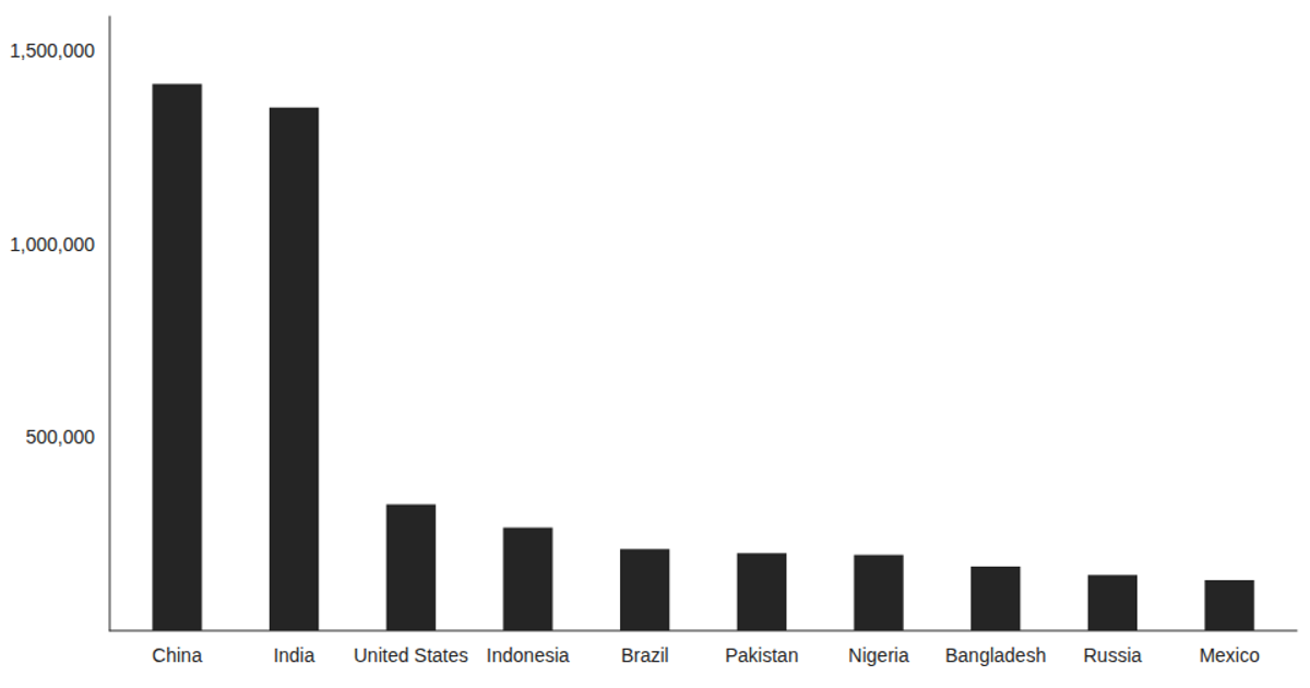
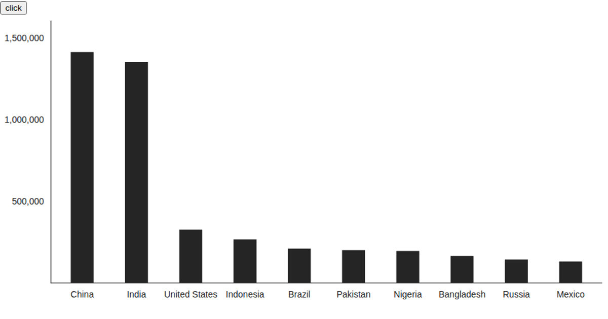
A bar chart displays population estimates for ten countries, from China at roughly 1.4 million to Mexico at 130 thousand, using data loaded from a CSV file. The React app uses the `useState` and `useEffect` hooks to fetch the data with `d3.csv`, converting population values to numbers. Victory’s `VictoryChart` and `VictoryBar` components render the bars, with country names on the x-axis and population on the y-axis, styled via a custom tick label font size and chart padding.
AI-generated descriptionThis example shows how to load data from a CSV file using React hooks and visualize the result using Victory Charts. Inspired by this Victory example from Swizec Teller in React for Data Visualization.
MIT Licensed




Comments
Sign in to join the discussion.