Yelp data map
The original dataset is from public Yelp dataset.
The data used for this visualization is filtered on top-rated restaurants in Greater Boston (GB) area. Top-rated restaurants are defined as 4 stars or above.
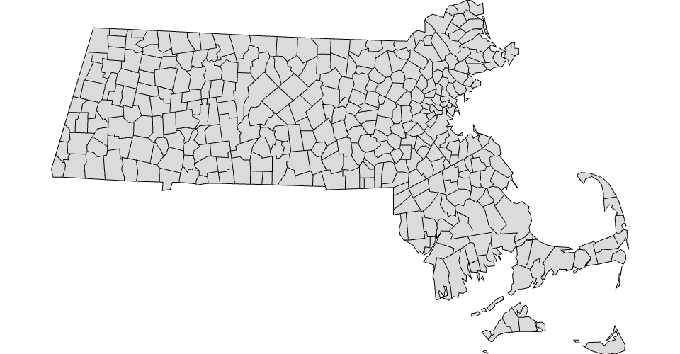
This map shows top restaurants distributions in GB area. This is an intermediate stage that just loaded MA state map, but haven't figure out how to visualize data on it.
I would use color shade (or the circle size) to represent the amount of restarutants in a city. The darker color (or a larger circle) means more best restarutants.
MIT Licensed