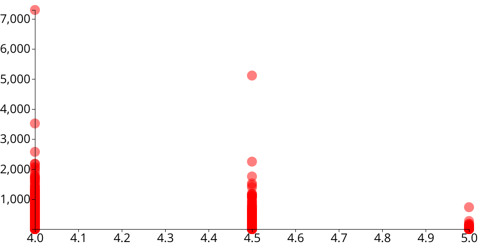
Scatter plot of Yelp data: review counts vs. stars
The original dataset is from public Yelp dataset.
The data used for this visualization is filtered on top-rated restaurants in Greater Boston (GB) area. Top-rated restaurants are defined as 4 stars or above.
This scatter plot shows number of reviews versus ratings on Yelp among these top-rated restaurants in GB.
X axis is the rate of restaurants based on Yelp stars, it can be 4, 4.5, 5.
Y axis is number of reviews.
This dataset is not optimal to be visualized by scatter plot, but at least there is a trend that the more reviews, the relatively lower rates as people always have different opinions.
*This is a part of week 3 assignmnet: Visualize your Data
MIT Licensed