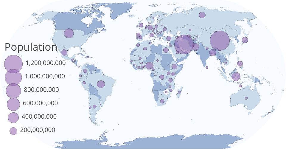
Visualizing population by country using circles on a map with world happiness score tooltip.
The area of each circle corresponds to the population of the country it represents. Once clicked it shows the happiness score.
You can also pan & zoom, and hover over each country for more information.
The data is from the The World Happiness Report that uses survey data, demographic information and statistical analysis to rank 156 nations according to the happiness of their people.
https://www.kaggle.com/arielyeung/world-happiness-data
https://gist.github.com/mkt-ds/640984c80835e2823c1b0f5c9a3fabe6
A country’s overall happiness score is a composite of different factors collected in an annual worldwide survey, including:
GDP per capita School years Sustainable economic development Employement Rate Health expenditure Government effectiveness Female MPS Control of corruption
What factors contributes to happiness for different countries is interesting. For example more school years increases happiness in certain countries, it's probably correlated with more salaries when a person studies more. I need to create another visual to show the relationship between each factors for each country.