🌍 Public
Fork of Victory!
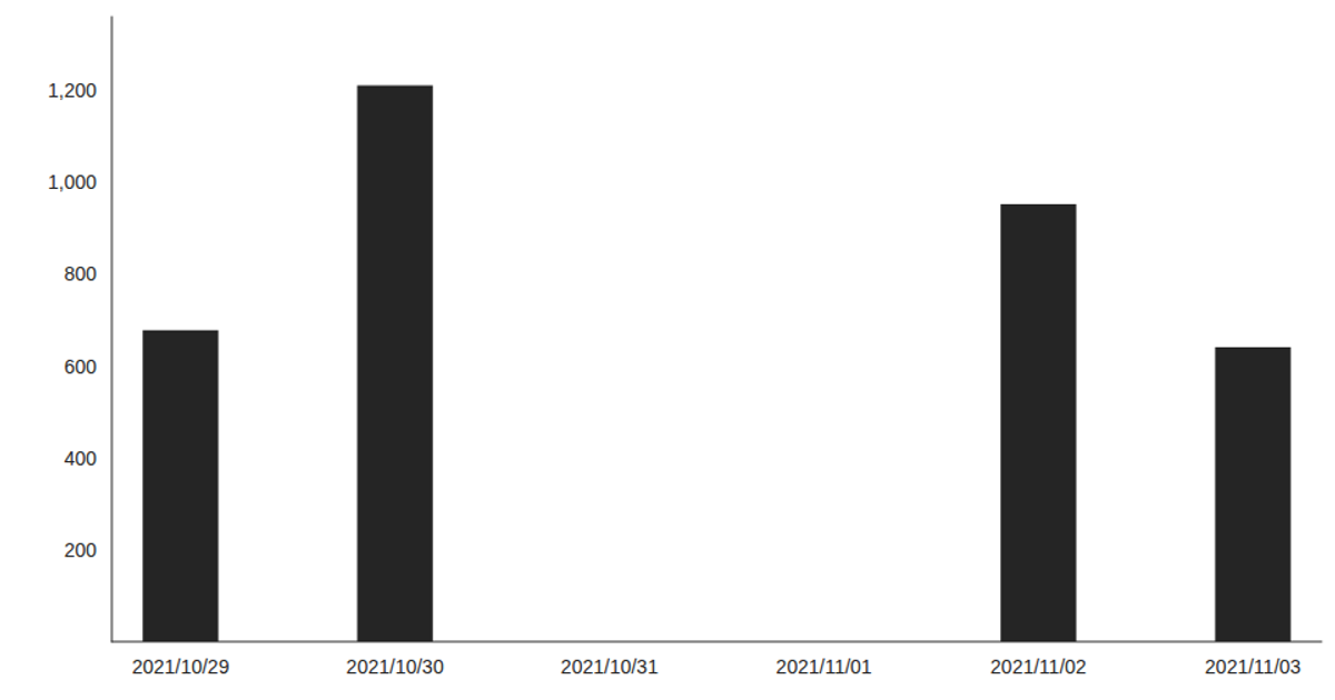
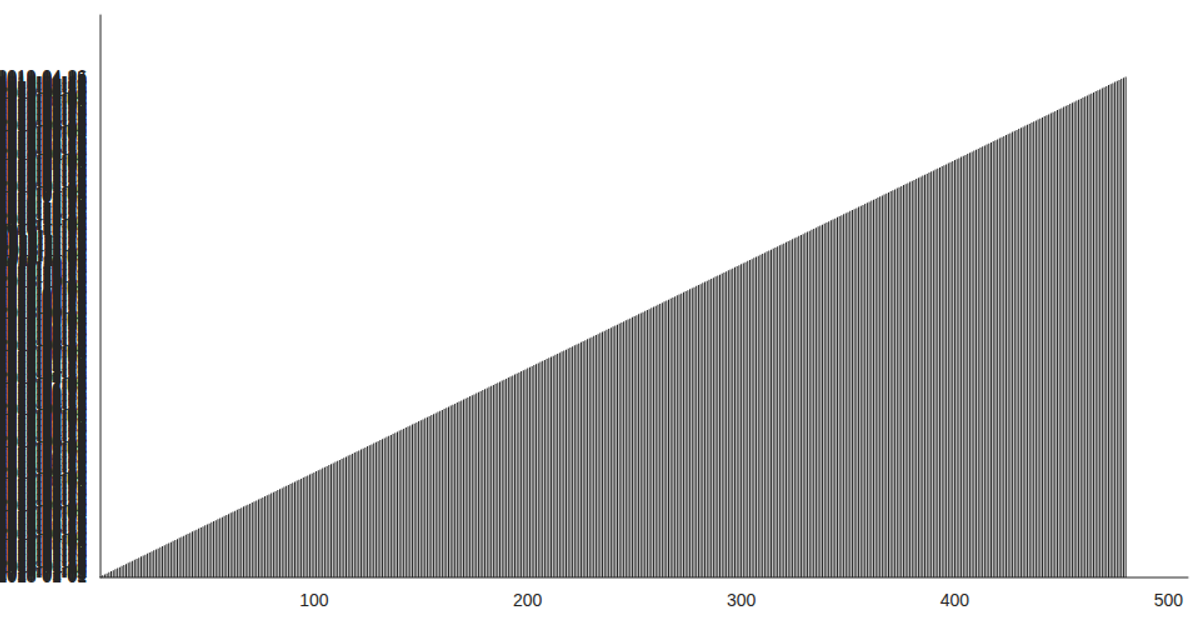
This example shows the number of patients per day as a bar chart, with days on the x-axis and patient counts on the y-axis. It loads a CSV file using the `csv` function from d3.v5 inside a React hook, then passes the parsed data to Victory Charts’ `VictoryBar` and `VictoryChart` components. The chart uses React’s `useState` and `useEffect` to fetch data asynchronously, and renders a fixed-width, 960×500 visualization with domain padding and custom tick label styles.
AI-generated descriptionThis example shows how to load data from a CSV file using React hooks and visualize the result using Victory Charts. Inspired by this Victory example from Swizec Teller in React for Data Visualization.
MIT Licensed



Comments
Sign in to join the discussion.