🌍 Public
Fork of Missing Migrants Date Histogram
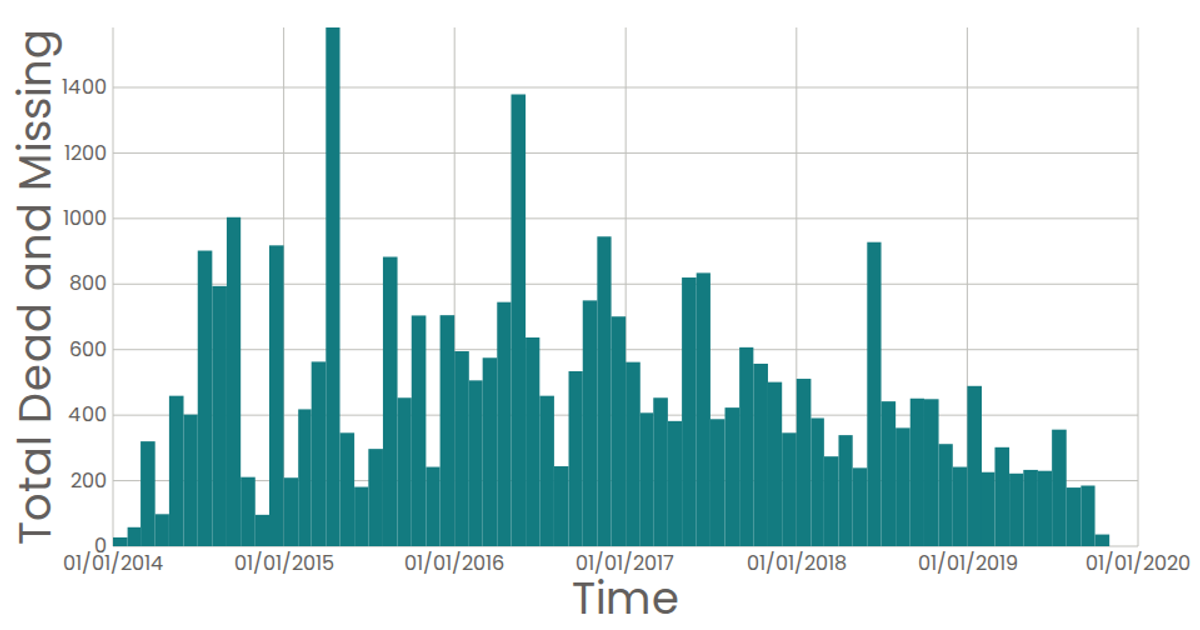
A histogram visualizes the monthly sum of dead and missing migrants from the Missing Migrants Dataset, with time on the x-axis and total fatalities on the y-axis. Built with React and D3 v5, it uses `d3.bin` to group reported dates into monthly thresholds and `d3.sum` to aggregate the "Total Dead and Missing" values for each bin. The SVG chart includes custom axis components, a tooltip via SVG `<title>`, and a Poppins-styled interface.
AI-generated descriptionA date histogram showing the sum total dead and missing migrants for each month.
Data from the Missing Migrants Dataset.
MIT Licensed



Comments
Sign in to join the discussion.