🌍 Public
tmp
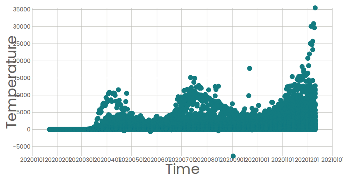
This example displays a line chart of COVID-19 daily new cases over time, with interactive data points. It uses D3 v6 to load CSV data from a local file, parse dates, and render the chart with axes, a line path, and circles for each data point. Hovering over a circle triggers a tooltip that shows the specific date and case count. The visualization is built with D3's `scaleTime`, `scaleLinear`, `line`, `axisBottom`, and `axisLeft` APIs, and rendered as SVG with a title header.
AI-generated descriptionAn example showing the capabilities of VizHub:
- Loads D3 via UNPKG.
- Demonstrates use of
importfrom"d3". - Demonstrates use of
importfrom local ES6 modules.
MIT Licensed







Comments
Sign in to join the discussion.