A visualization constructed using the vega-lite-api.
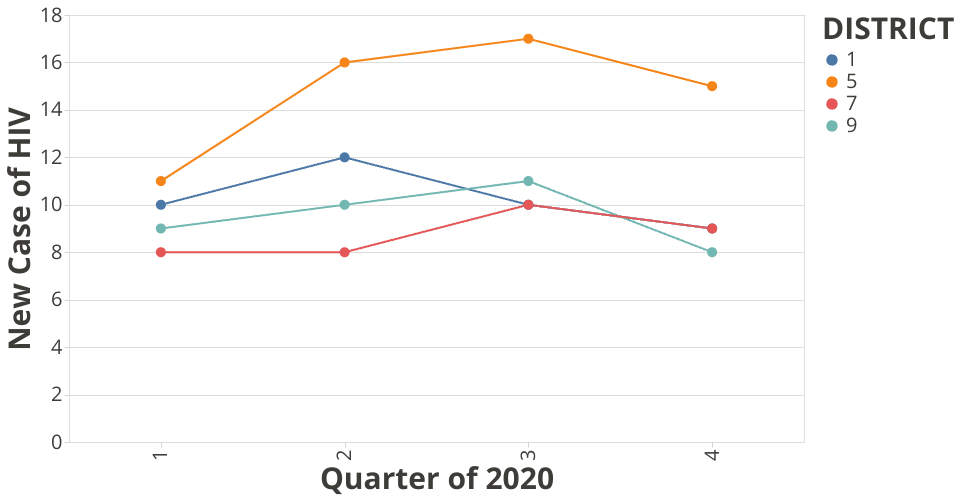
The data shown here comes from the Bangkok Smart Monitoring System. The line charts represents the number of new HIV cases aggregated by district (in Bangkok).
Development: Right now, this works is in the progress of adding the interaction between users. It currecntly show the results of district 1,5,7 and 9. But these districts will be selected by the clients in the future (note: this will change the paramater and chart automatically).
Questions: How many new cases of HIV compared between districts: E.g. looking at the data, we can see that district 5 has in overall increasing trend, wherease other seems to be stable (and also decrease down).
My experience building in visualization is learn more about Vega-lite API where combining multiple layers using vl.layer(). One challenge I experience would be if there is one district that has a very high number of cases, other lines will shrink and make it hard to see clearly. The other possible apporach might be using the group bar charted sitting next to each other, which I will explore next.