my-draft
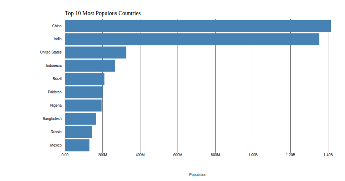
This bar chart shows the population of the top 10 most populous countries, using 2018 estimates from the United Nations World Population Prospects 2017. It builds on a previous bar chart example and demonstrates customization of D3 axes. The code uses d3.csv to load data, d3.scaleLinear for the x-axis, d3.scaleBand for the y-axis, d3.axisBottom with a custom tick formatter, and d3.axisLeft. The SVG rendering includes a title, axis label, and removes default domain lines and ticks.
AI-generated descriptionThis bar chart shows population of the top 10 most populous countries. The data comes from the year 2018 estimate in United Nations: World Population Prospects 2017. It also demonstrates customization of D3 axes.
See also the first bar chart visualization that this one builds on: Making a Bar Chart.





Comments
Sign in to join the discussion.