Airlines Bubble Chart Visualization
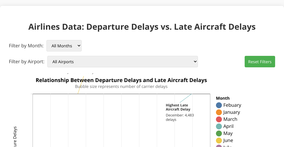
This interactive data visualization shows the relationship between departure delays and late aircraft delays across different airports and months. The bubble chart provides a multi-dimensional view of airline delay data with:
- X-axis: Number of Late Aircraft Delays
- Y-axis: Number of Departure Delays
- Bubble size: Number of Carrier Delays
- Bubble color: Month of the year
Features
- Interactive tooltips that show detailed information when hovering over bubbles
- Filtering capabilities by month and airport
- Dynamic annotations highlighting significant data points
- Color-coded bubbles by month for easy comparison across time periods
- Size representation showing the magnitude of carrier delays
- Correlation analysis and trend line (when significant correlation exists)
- Responsive design with clear axis labels and legends
- Animated transitions when changing filters
Data Source
The visualization uses airline delay data from filtered_airlines.csv which contains information about:
- Airport codes and names
- Time periods (month and year)
- Different types of delays (carrier, late aircraft, national aviation system)
- Flight statistics (total flights, delayed flights, on-time flights)
Technologies Used
- D3.js v7 for data visualization
- d3-legend for creating consistent legends
- d3-annotation for adding contextual annotations
How to Use
- View the entire dataset initially to see overall patterns
- Use the month filter to focus on specific times of year
- Use the airport filter to examine delays at particular airports
- Hover over any bubble to see detailed statistics including:
- Airport name and code
- Month
- Various delay metrics (departure, late aircraft, carrier)
- Total flight counts and delay percentages
- Look for annotated data points that highlight important insights
- Observe patterns between departure delays and late aircraft delays
- Reset filters at any time to return to the full dataset view
Insights
The visualization reveals several patterns:
- A strong correlation between late aircraft delays and total departure delays
- Seasonal variations in delay patterns
- Airports with consistently high or low delay rates
- The relationship between carrier delays and overall delays
Full Course Information
Full course playlist: YouTube: Constructing Visualization 2024
MIT Licensed