City Housing Data Visualization
This project visualizes housing data for various cities in the United States, including metrics like median home prices, population, household income, and more.
Visualizations
The project includes multiple visualization types:
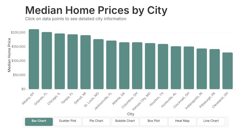
- Bar Chart - Displays median home prices by city
- Scatter Plot - Shows the relationship between household income and median home prices
- Pie Chart - Visualizes population distribution by city
- Bubble Chart - Represents population size with bubble size and unemployment rate with color
- Box Plot - Shows statistical distribution of housing metrics
- Heat Map - Displays correlations between different city metrics
- Line Chart - Explores the relationship between job growth rate and home prices
Usage
Click on the navigation buttons at the bottom to switch between visualization types. Interact directly with data points to see detailed city information.
Data Source
The data includes information on various US cities, with metrics like population, median home prices, rent, household income, job growth, and unemployment rates.
MIT Licensed