The data visualized is from dataset "EV_Data" which was used in the 2nd assignment. [Source]: "https://www.kaggle.com/datasets/fatihilhan/electric-vehicle-specifications-and-prices"
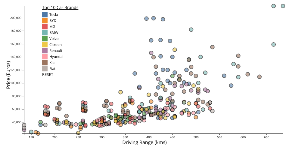
The graph represents a scatter plot of electric vehicles, where the driving range is plotted against price. X-axis represents the driving range of the vehicle on a single charge in kilometers. Y-axis represents the price of the electric vehicle in Germany.
Each point on the scatter plot represents a different electric vehicle model, with distinct colors indicating different car brands. The visualization aims to provide insights into how the driving range of electric vehicles correlates with their price, offering potential buyers a visual comparison among various models. By hovering over any point on the plot, users can see additional details about each vehicle, such as the brand, exact driving range, and price, enhancing the interactivity and informational value of the graph.
Edit: Added an interactive legend of the 10 cars in the dataset in order of their occurance.