The data visualized is from dataset "EV_Data" which was used in the 2nd assignment. [Source]: "https://www.kaggle.com/datasets/fatihilhan/electric-vehicle-specifications-and-prices"
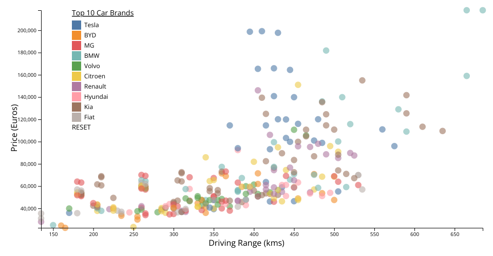
The graph represents a scatter plot of electric vehicles, where the driving range is plotted against price. X-axis represents the driving range of the vehicle on a single charge in kilometers. Y-axis represents the price of the electric vehicle in Germany.
Each point on the scatter plot represents a different electric vehicle model, with distinct colors indicating different car brands. The visualization aims to provide insights into how the driving range of electric vehicles correlates with their price, offering potential buyers a visual comparison among various models. By hovering over any point on the plot, users can see additional details about each vehicle, such as the brand, exact driving range, and price, enhancing the interactivity and informational value of the graph.
Edit: Added an interactive legend of the 10 cars in the dataset in order of their occurance.
Comments
Hey, its a great viz. Can I use your viz in a blog post which is dedicated to ev-vehicles? I will embed your work in the blog. Another way we can write the blog together. https://ev-finance.io/ is the blog website. Please have a look and let me know your thoughts. Thank you.
Very nice! Excellent work with the tooltips and color legend filtering! One suggestion: notice how the text is getting "thick" each time you interact. This is because multiple duplicate elements are getting appended. In your code you have a pattern like this:
That needs to be modified to use the data join pattern, so that when the function runs over and over, only a single group element is ever created. Also, because you have multiple g elements, you can disambiguate between them using classes. Here's the updated logic:
If you use this pattern for the axes and labels, you can fix the issue of the "thick" text caused by duplicated elements.
Thank you Nita, appreciate it! Yes, you can definitely use my visualization in your blog post.
Thank you for your feedback Professor. I tried implementing the data join pattern to prevent element duplication and addressed the "thick" text issue as well.
Hey, The blog post is live at https://ev-finance.io/comparing-ev-prices-and-ranges-across-models/. I can add you as a collaborator on this blog post as you created the viz. Let me know your thoughts. Thanks.
Excellent! I see it's fixed now. This scatter plot would be perfect for using a Voronoi overlay to improve the interaction!
Hi Nita. Sure, you can add me as a collaborator as well. Thank you!