Interactive bar chart of food categories in top rated restaurants.
The original dataset is from public Yelp dataset.
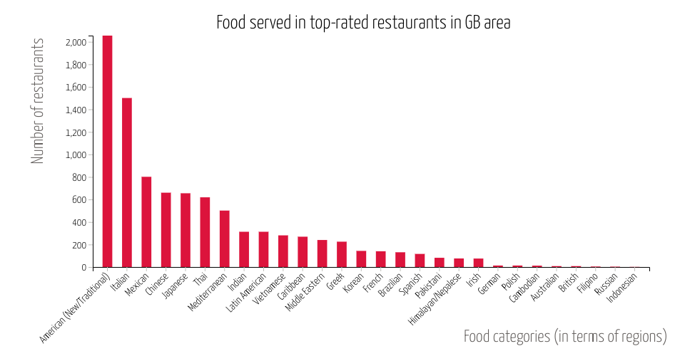
The data used for this visualization is filtering on top-rated restaurants in Greater Boston (GB) area. Top-rated restaurants are defined as 4 stars or above.
This bar chart shows what type of food (in terms of regions) served in top-rated restaurants in GB area, and sort them in amounts of restaurants. We can tell that there are over 2000 restaurants are new/traditional American food related, and we also have over 1500 top-rated restaurants serve Italian food.
I added an interaction for hover highlighting such that when the user places their mouse above a bar in the plot, the exact number of restaurants would show up.
*This is a part of week 7 assignment: Project Momentum
MIT Licensed