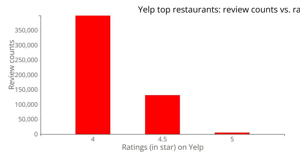
Bar plot of Yelp data: review counts vs. stars.
The original dataset is from public Yelp dataset.
The data used for this visualization is filtering on top-rated restaurants in Greater Boston (GB) area. Top-rated restaurants are defined as 4 stars or above.
This bar chart shows total number of reviews versus ratings on Yelp among these top-rated restaurants in GB. We can tell that the more reviews a restaurant receives, the lower rate it will has.
This is the iterated work of a scatter plor of Yelp data. I changed how the data is visualized as I think a bar plot makes more sense if doing comparison of categories. Instead of plotting review count for each restaurant, I chose to visualize the total review counts for each categories and this would be more appropriate when comparing among categories. Besides, I also added labels for both axes, a title (from peer's feedback), as well as used a new font.
*This is a part of week 5 assignment: Iterate Your Work