Data Visualization Project
Project Progress in VizHub
Data
The data I propose to visualize for my project is a Pokémon Base Stats Dataset, which consists of most (if not all) Pokémon. Each Pokémon has an associated list of attributes, which includes a:
- Name
- Type
- Species
- Height
- Weight
- Abilities
- Catch Rate
- Base Friendship
- Base Exp.
- Growth Rate
- Gender
- HP (Hit Points)
- Attack
- Defense
- Sp. Atk
- Sp. Def
- Speed
The reason I really like this dataset is because of the number of features for each Pokémon, and gives me a creative outlet for visualizing this data in a unique way. Who is this for? What will it enable them to do? Well, this visualization can be for gamers and game developers/designers alike. The data can help gamers pick out a good lineup, depending on what kind of Pokémon they prefer. On the other hand, game developers may want to study the balance in character design. After all, it's rare for a Pokémon to have all of the best abilities. My project in particular will primarily facilitate the visualization of speed and attack vectors, while also including Pokémon type and HP attributes as well. So far, I have come to the conclusion to present this data in a scatterplot, though I have gone through some other iterations such as a bubble chart and a radar chart.
Questions & Tasks
The following tasks and questions will drive the visualization and interaction decisions for this project:
- How does the Pokémon's speed correlate with its offensive stats?
- Is there a correlation between a Pokémon's HP and Speed?
- What can the Pokémon type tell us about the Speed of that type compared to all other Pokémon (if anything)?
- What can the Pokémon type tell us about the HP of that type compared to all other Pokémon (if anything)?
- What can each quadrant of the scatterplot tell us about all Pokémon? Are they evenly distributed? Are there any outliers?
The ultimate aim of these questions is to unravel any answers as to how the Pokémon are distributed so that gamers and game developers alike can benefit from this design or game strategy.
Sketches
The following is my first iteration of a scatterplot sketch with respect to the Pokémon dataset, which precedes my digital iteration of a scatterplot.
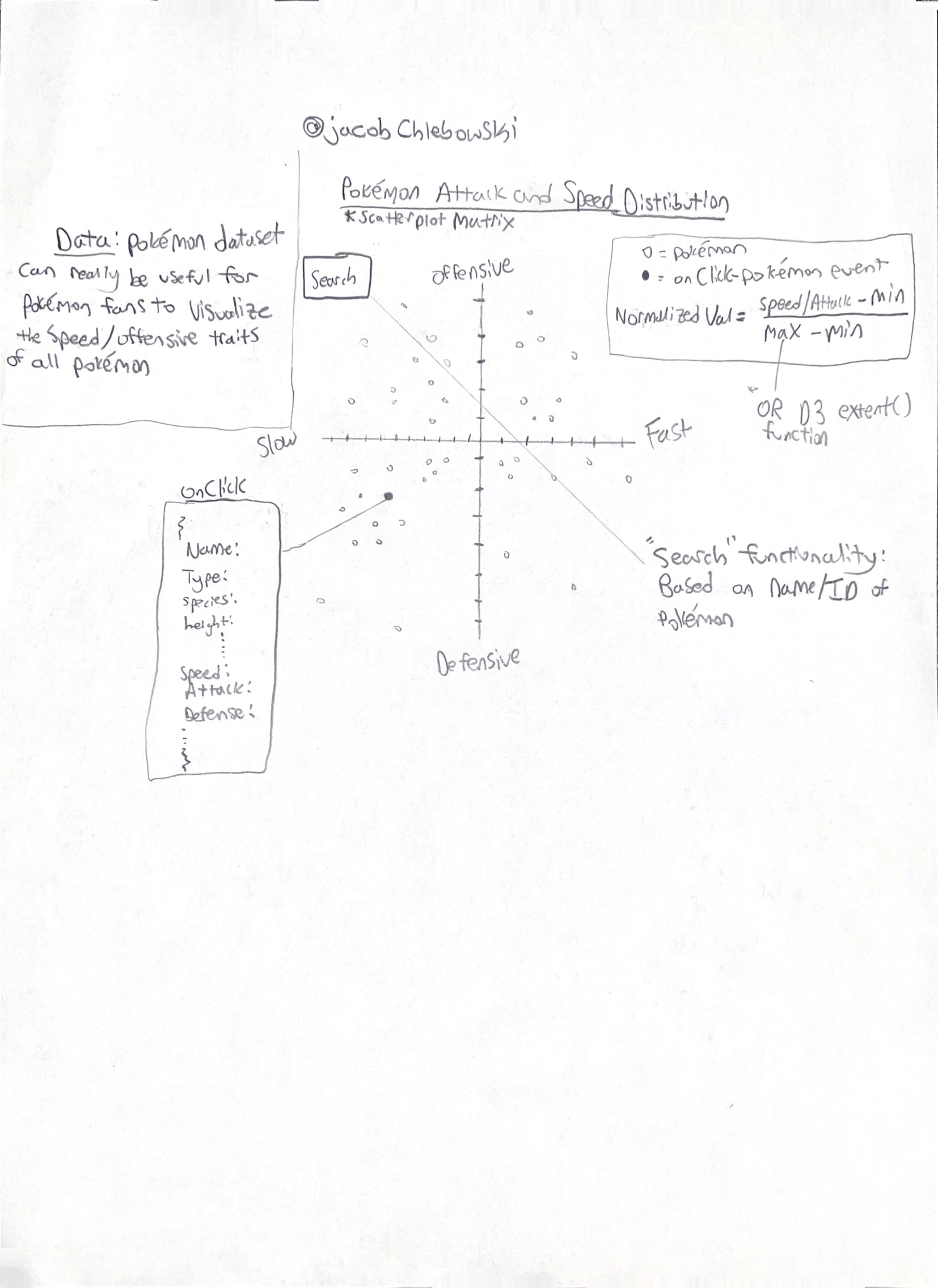
- This original sketch of the scatterplot was focused on visualizing the offensive/defensive and speed attributes of Pokémon. This sketch also visualizes an onClick feature in which an end-user could interact with each of the points on the graph. It was at this point when I realized the scatterplot showed much potential in terms of visualizing more attributes, which could benefit gamers and game developers

- Shortly after creating this first sketch and receiving feedback from classmates, I was able to enhance it by creating a digital iteration, which includes the visualization of a couple of more attributes (HP and Pokémon type)
Prototypes
Starting from when I first discovered this dataset, I was able to produce the following VizHub projects (visualizations):
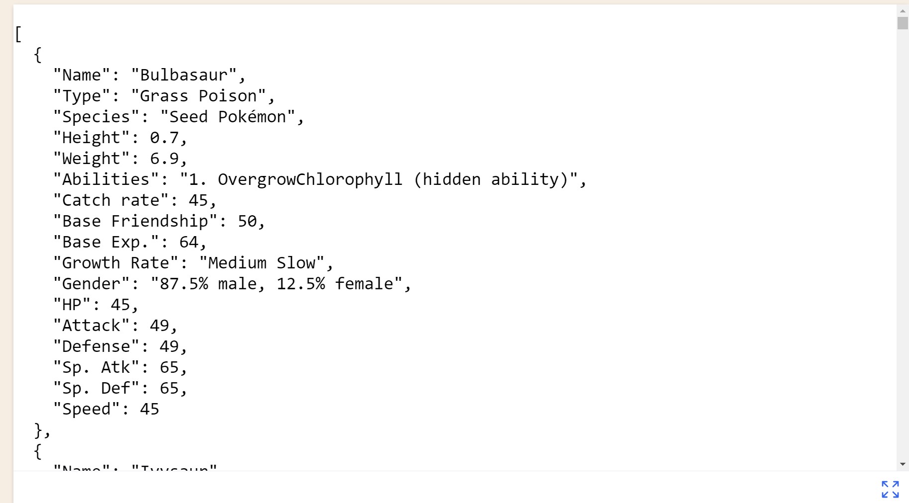
- Week 2 First, I imported the base stats dataset into my own repository, where I changed all numerical strings into numbers
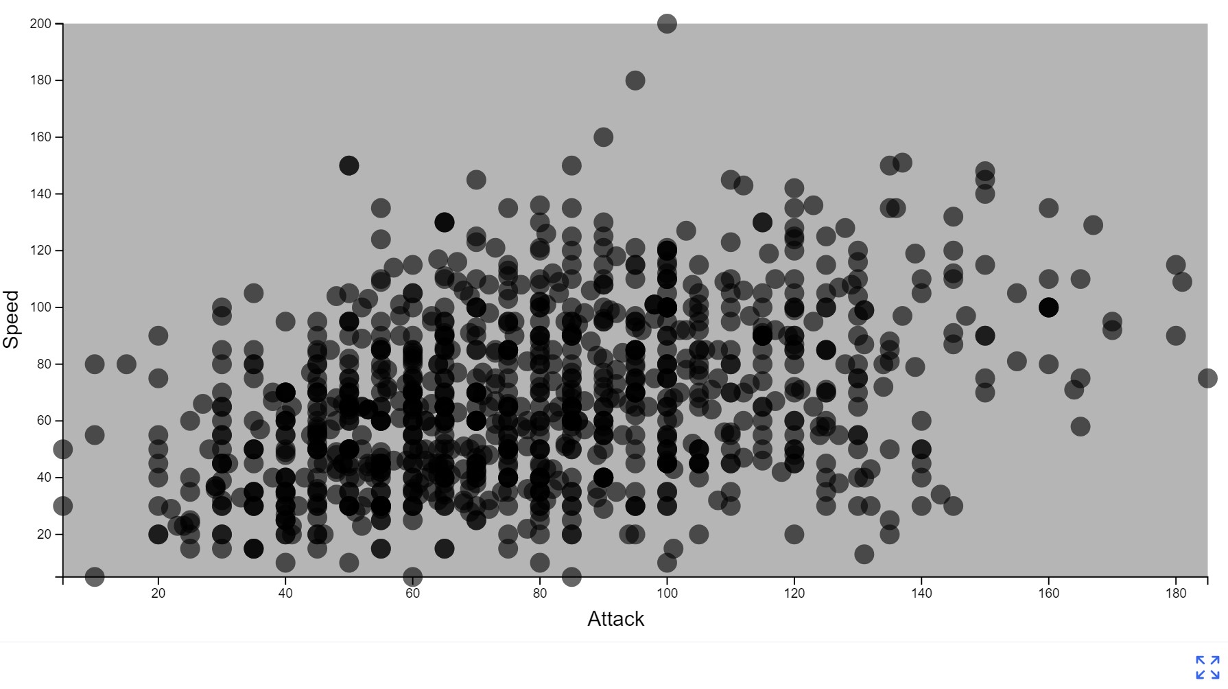
- Week 4 Then, I used that dataset with the numerical values from week 2 to create a simple scatterplot, with a background, hue, and axis
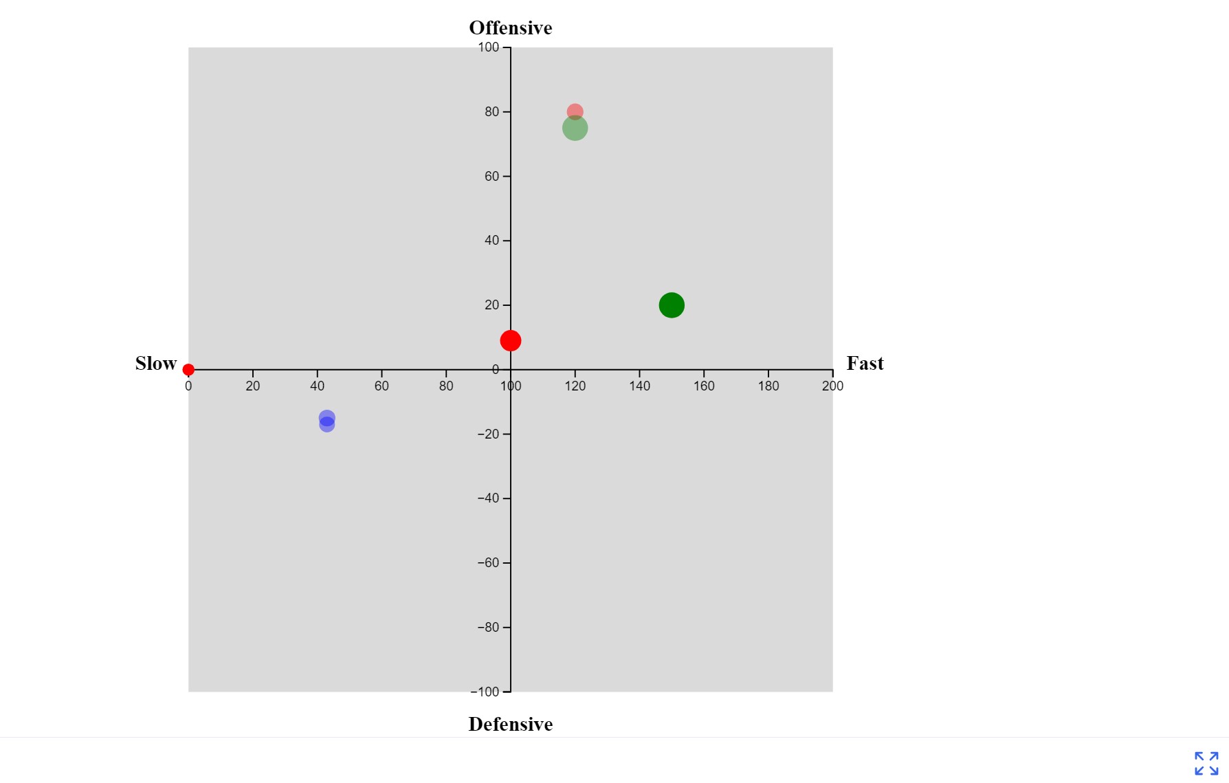
- Week 5 Finally, I utilized what I had from week 4 to expand my axis, and change the hue/size of the points on the graph based on the attributes of the pokemon (although no dataset was introduced quite yet)
Open Questions
Some thoughts or concerns I have about the project:
- I want to continue the work from the Pesudo-Visualization (week 5) by implementing the csv dataset
- I received a recommendation to enable exploration of multiple quantitative attributes: X and Y, and even color which could be controllable with menus. I do like this idea, so I may try to implement that, though I'm not 100% sure where I want to start with that.
Milestones
- Week 9 (after break): I want to implement the csv dataset into the graph comfortably. I want to see the dataset in its entirety
- Week 10: Once csv is implemented/loaded properly, I'll likely run into a density/volume issue. I will attempt to try either a forced directed layout to spread them out, or a 2D binning to show density (though I might lose color with this approach, so I will look for alternatives)
- Week 11: Once I can comfortably visualize the graph as intended, I would like to go back to Week 6 to implement a mouse follower (not sure what for yet, but I want to find something cool to do with it). I also want to create a responsive viz container and responsive axis!
- Week 12: TBD... I will add more milestones as the weeks go on, and will also take feedback from classmates to help with the milestone creation
Milestone Progress:
Week 9 (after break):
- Successfully implemented the project and the csv to show
the all the pokemon plot points.
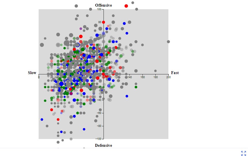
Week 10:
- I wanted to filter Pokemon displayed on graph. I
successfully created buttons and onClick functions that
display only the Pokemon of a certain type (which I
trimmed down to Water, Fire, Grass, Normal, Electric, Bug,
Psychic, Rock, and ALL). Unfortunately, I came across an
issue where the plot points (filtered points) weren't
exactly aligning with the graph's X axis (shifted too far
to the left).

- Fortunately, I was able to resolve the issue by styling
within the SVG to center the scatterplot, and ultimately
align the points correclty.

- While it doesn't seem like it, much progress has been made for visualizing these different types of Pokemon in a really effective way.
- Lastly, I've added another onClick feature which when a
plot point is clicked, an alert displays the the Name,
Type, Speed, Attack, and Defense of the Pokemon.

- Next week, I will start by attempting to change the onClick feature so that instead, a label on the graph will display the features instead of an alert message! I will also need to fix the "All" button onClick, where it currently displays nothing
Week 11:
- This week, I first wanted to fix the button filtering for
Pokemon points. Toggling points was a bit funky with
displaying points and then when "All" was clicked, nothing
would show unless clicked again. I tried
selectedType = type === 'All' ? null : type;to set selectedType to null if the "All" button is clicked, meaning no filter will be applied. - Added a legend! Professor Kelleher's video on this was particularly helpful.
- Added a label displaying Pokémon attributes when clicked
on! While this needs to be modified to make it look a bit
better, it's functional (a big win for me). I implemented
this by creating a setSelectedPokemon(pokemon) function,
in hue-and-size.js, which essentially stores the selected
Pokémon within the ``selectedPokemon` variable, and grabs
its details with a document.querySelector. So ultimately,
it's a bit of DOM and event handling to send information
from the csv to the front end.

- Next week, I hope to fix the legend first, and then start on something unique. Perhaps the mouse follower I was talking about. Another issue I would really like to focus on is the hot reloading since that's a bit funky. Finally, I'd like to see if I can make this more dynamic. Not sure what I want to do for that yet, but I'll brainstorm this week and see what I might be able to come up with.
Week 12:
- This week, I started by fixing hot reloading. This required going back to some older videos. This improved the coding process and overall efficiency of the program since the graph wasn't being redrawn everytime.
- Next, I studied the week 12 module for an interactive viz. For now, I incorporated a hover implementation over the legend, which tells us how many Pokemon are within each type.
- Finally, I did some code cleanup. Next week I'm going to
fix the positioning of the labels again. I was also
considering changing the hover functionality so that it's
for the points on the graph, but I also just like the
onClick feature displaying more data/info as well. Not
sure what I'll do yet.

Week 13:
Polishing!
This week, I started by updating my colors a bit better to match what I think makes the most sense for the Pokemon. The yellow color for normal was a bit too wacky.
Next, I positioned the text (popup when clicking on a point on the graph) so that it no longer overlaps with the graph. Overall, I'm super happy with how this turned out since first diving into this dataset a couple of months ago


Week 14:
Updated README to read like a report.
Added a title
Cleaned up more code for hot-reloading
Made the DataViz a bit more appealing and positioning upgrades

Description of Finished Product and Future Work:
- I'm very proud to share this product that I've envisioned during the first month of this course. Since encountering this dataset, I wasn't entirely sure how I would reach my goals. By breaking down the larger goals into smaller ones, it allowed me to make more meaningful progress, recognize errors, and even discover new avenues to improve the visualization as a whole.
- Description: This visualization is for both gamers and game developers alike (particularly those interested in Pokemon). The scatterplot shows the distribution among Pokemon and their base stats as well as their type, attack/defense, speed, and even the volume of Pokemon that are similar. Upon clicking a point on the graph, it shows all of the stats for that Pokemon. The end-user may also filter which Pokemon are on the scatterplot at a given time if they so choose. For example, if Pokemon gamer wishes to add a "Fast Psychic" to their Pokemon collection, this scatterplot makes it really simple to view those potential options.
- Future Work: Of course, there's always room for future work to be done on this visualization. Some ideas I had include a dynmaic attribute selection, which allows users to choose which attributes (Speed, HP, Attack, etc. to plot on the X,Y axes for flexibility). Another idea I had was a 3D graph, a more advanced visualization that represents another attribute of data such as a special attack.