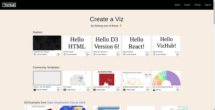
This looks great! 
A couple of thoughts:
The first is whether examples could be labelled upfront as D3 v5, v6 etc. This would help ease one’s search and exploration. In fact, I wonder if the version number could be pulled automatically.
The same could apply for React but then again that remains mostly (as of the present moment) backwards-compatible. Indeed, the biggest jump for me has been more of a mental one (between classes and hooks).
Second, would it be useful to also have examples categorised by the kind of data stories they show? One of your videos touched very nicely on this important topic around different data types suggesting different data visualisations. Some basic categories could be distribution, composition, change over time, and relationships between data. Something like each of these could have an example of an appropriate visualisation for either categorical, ordinal, or numerical data. For example:
- Distribution
- Bar chart (categorical data)
- Histogram (numerical data)
- Composition
- Pie Chart, Stacked Bar Chart
- Change over time
- Line chart (numerical data)
- Relationships
- Scatterplot (numerical data)
- Mosaic plot (categorical data)
Obviously, the above is a terribly rough sketch and I defer to your knowledge about categorisations, and what best visualisations best match them.


 )
)