Independent Study: Visualizing Social Media Data
Data
The data I have visualized is from my Social Media MQP, and the dataset can be found here. This dataset is comprised of survey responses, where each respondant answered Likert scale questions on their recent social media use. Each question correlates to one of four scales: community building, self-expression, content discovery and user agency. Users optionally provided their age range, race, gender and sexual orientation.
Explanations of our scales from our MQP website are as follows:
Community on social media measures our social tendencies to connect with others on the internet. If social media encourages empathy, talking with your friends, family, and loved ones, or enables discussion amongst a like-minded group, it encourages community. All social media will have some community, as they are all social, but some may have features that distract from connections or make it harder to stick with a community, and will score lower.
Discovery relates to a user’s desire to see something new. Scrolling through social media for non-social reasons often means looking for something new to entertain, educate, or fascinate. We are interested to see how satisfied users are with the content they find and if content by small creators can be discovered by other audiences on the platform. For there to be new content for a user to discover, new creators need to be encouraged by the platform.
Agency is related to user safety and comfort. Sometimes users are not looking for anything new, but instead old comfortable memories or their favorite videos from a while ago. Although users may want something new, they might find something they don't like and need tools to avoid it in the future. Social media feeds are tailored to the user, so the user needs to have some control over the space they want to create. Blocking people can protect from harassment, while muting words or tags (like on Twitter and Tumblr) can help you avoid posts that make a user uncomfortable. Moderation teams are necessary to keep content safe, and community lead moderation can create rules to fit a communities custom needs. We hope to measure how customizable, comfortable, and safe a platform is using this scale.
Self-Expression relates to how social media enables self-presentation, self-exploration, and the ego. Profile customization options can allow many to create authentic or inauthentic personas. Posts are often linked with virtual “achievements” such as likes or re-shares that can affect the ego. This scale aims to measure how a platform encourages identity presentation or getting lost in the crowd.
Questions & Tasks
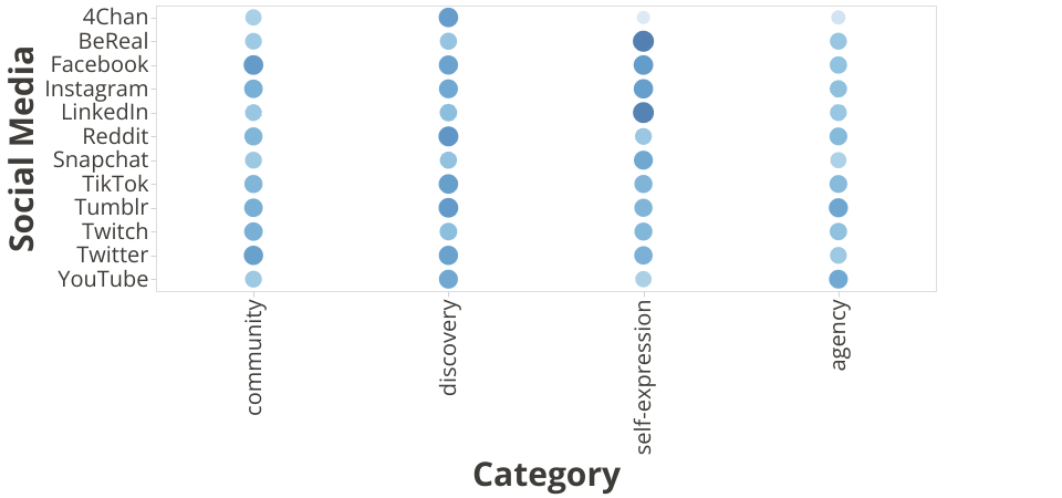
I want to visualize the perception of twelve social media with relation to demographics. The demographics include age, race, gender and whether the user identifies as LGBT. The twelve social media are BeReal, Facebook, Instagram, LinkedIn, Reddit, Snapchat, Tumblr, Twitch, Twitter, YouTube and 4chan.
- How well do social media encourage or inhibit community building, self-expression, content discovery and user agency?
- How varied are the demographics that responded to our survey?
- How do different demographics view social media as a whole?
- Does social media encourage some groups more than others?
Final Deliverables
Video Presentation (YouTube)
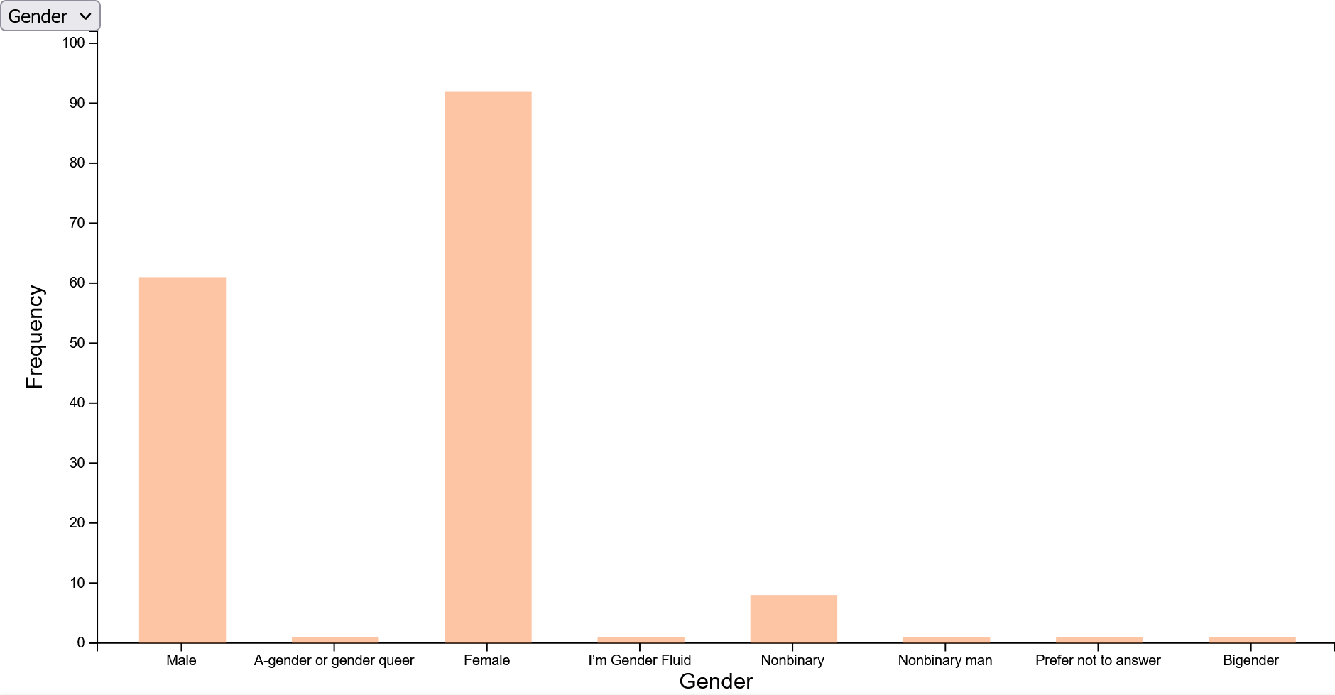
Survey Histograms


Social Media Comparisons


Prototypes
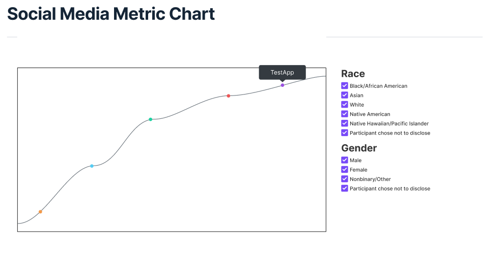
The first prototype created was during prototyping of my MQP. We envisioned that for each scale we defined, we would plot each social media as well as a toggle of our demographic options.

The next prototype created is on our MQP website. This scatterplot counters community and self, and discovery and agency. During our MQP we were unable to integrate demographic data. Additionally, this obfuscates the actual values by contrasting the scales.
 Instead of a psuedo-visual, I have created a histogram using simple data. This histogram is a prototype, which I then forked and modified for the final visuals.
 Additionally, I have created a psuedo-visual of a bubble chart. This would later become the final bubble chart visualization.
Sketches
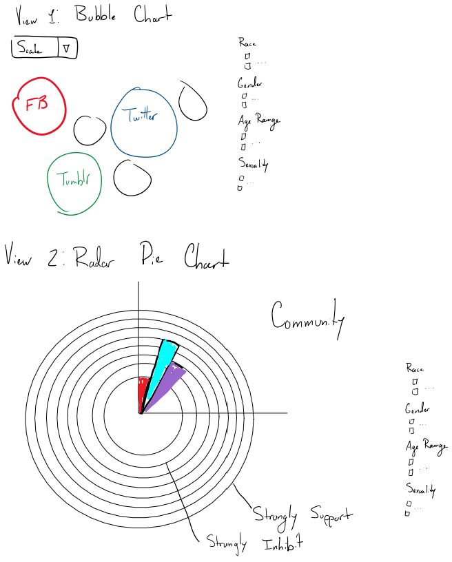
View 1 displays a bubble chart, which will show all social media. The size of the bubble will correspond to the Likert scale value, where a Strongly Inhibits is a 1, and a 7 will correspond to Strongly Encourages. A dropdown will allow the user to change the scale being displayed. View 2 displays a radar pie chart. The pie chart will be divided into quadrants, with each quadrant representing a scale. This visualization was scrapped because it felt too cluttered, but I encourage others interested in trying out this visual. For both views, a checkbox would be displayed next to the view to allow the user to pick and choose demographics. On default, all boxes will be checked and all data will be displayed.
Future Work
Some ideas for future visualizations are as follows:
- Checkboxes to narrow down data between demographics
- Integrating current visuals into our MQP website