This variation of the original work by @bootshine2 shows how you can:
- Make the rectangles right next to each other.
- Change the color scheme.
- Sort by the worst hit states.
- Use tooltips for multiple fields.
A visualization constructed using the vega-lite-api taking advantage of the markPoint function and the separation of data by color.
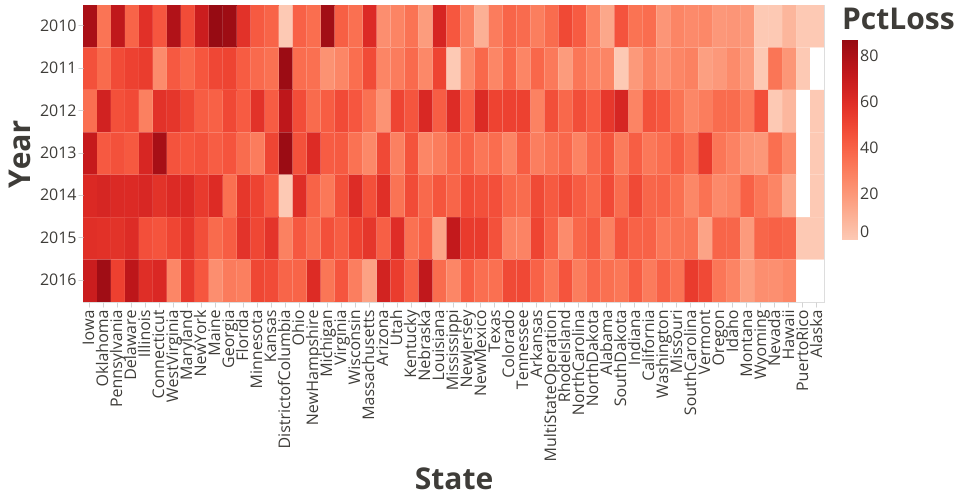
This visual depicts data from Bee Colony Loss3.csv, which is the third iteration of the Bee Colony Loss data (all are at Steve Matthews' GitHub Gist page).
Each square represents the percentage loss of bee colonies in the state during the denoted year (when the census was taken).
This visualization is intended to show hotspots or trends with regard to the loss of bee colonies in US states over a period of time. My question was about whether there is a correlation between particular states and loss, or particular areas of states and loss.
If I fullscreen the visualization and review it for trends, I find a very random pattern. I thought I might find that particular states' bee colony loss increased or decreased over time and that nearby states would show a similar pattern. While I don't have enough knowledge yet to show the states beside nearby states, an understanding of what states are near what other states shows me based on this visualization that there are no specific trends or particular hot spots that can be found.
So, bee colony loss is random and consistent across the US. While this seems uninteresting, it is actually interesting that we can discover this.