Inspired in Bar Chart example by Curran Kelleher that can be checked here.
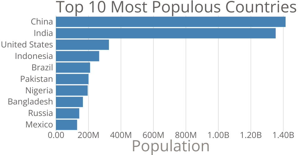
This bar chart shows population of the top 10 most populous countries. The data comes from the year 2018 estimate in United Nations: World Population Prospects 2017. It also demonstrates customization of D3 axes.
MIT Licensed