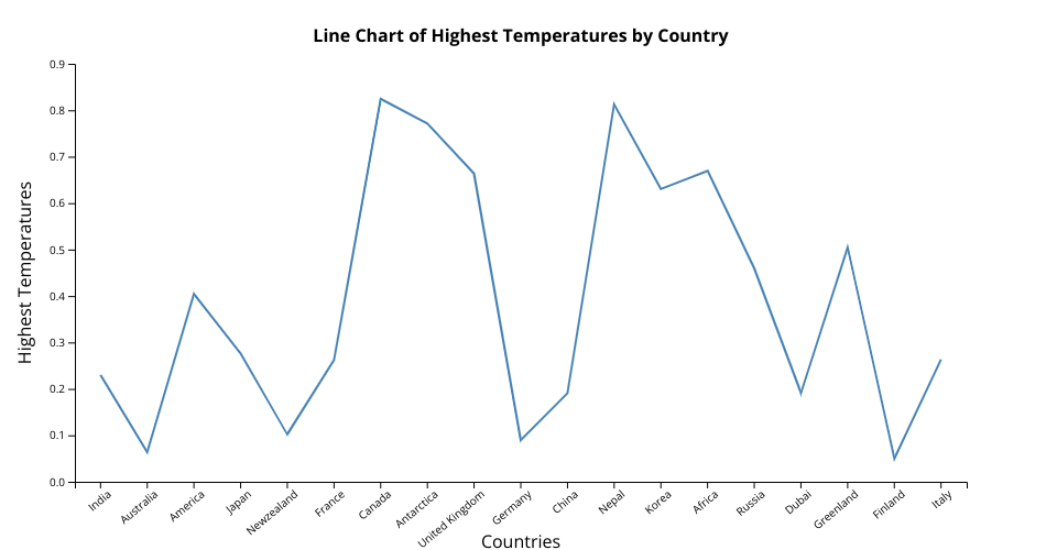
This line chart displays the highest recorded normalized temperature values across a selection of countries. Each point represents a country, and the y-axis shows its highest temperatures value between 0 and 1. The x-axis represents different countries as categorical variables, while the line connects each point in the given order.
MIT Licensed