Migrant Deaths Linked Views with Fast Brushing
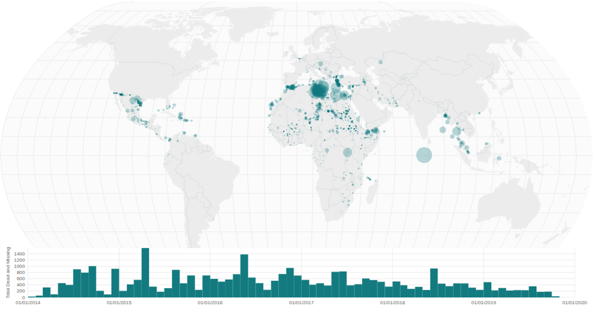
This example presents a linked view of migrant deaths worldwide. A bubble map displays the total dead and missing across geographic locations, while a date histogram beneath it shows the temporal distribution. Fast brushing on the histogram filters the map’s data points in real time, highlighting only incidents within the selected date range. The visualization is built with React and D3 v5, using `d3.geoNaturalEarth1` and `d3.geoPath` for the map projection and `d3.scaleSqrt` for bubble sizing, with data from the Missing Migrants Global dataset.
AI-generated descriptionA world map showing cities with population greater than 50,000. City data from Simplemaps: World Cities Database.
Country boundaries from World Atlas TopoJSON, polished for visual style, including graticules.
This iteration is optimized for performance using React's useMemo hook.




Comments
Sign in to join the discussion.