🌍 Public
Iris dataset
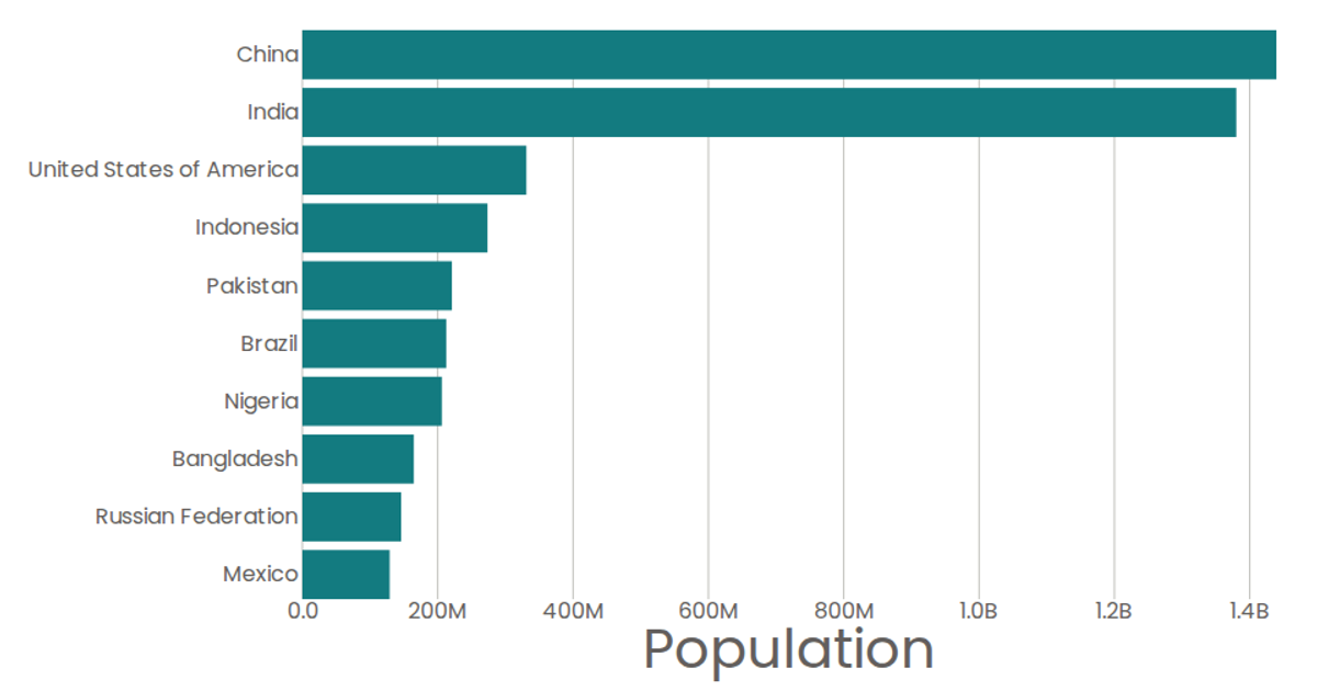
This bar chart displays the top 10 most populous countries in 2020, using horizontal bars sorted by population. The visualization is built with React and D3 v5, employing `d3.scaleBand` for the categorical y-axis and `d3.scaleLinear` for the numeric x-axis. SVG `<rect>` elements represent each country, with axes rendered as custom React components. Data comes from the United Nations World Population Prospects 2019, loaded via `d3.csv` and formatted with `d3.format`.
AI-generated descriptionA program that shows the top 10 most populous countries as a pathetic bar chart with no axes.
MIT Licensed




Comments
Sign in to join the discussion.