
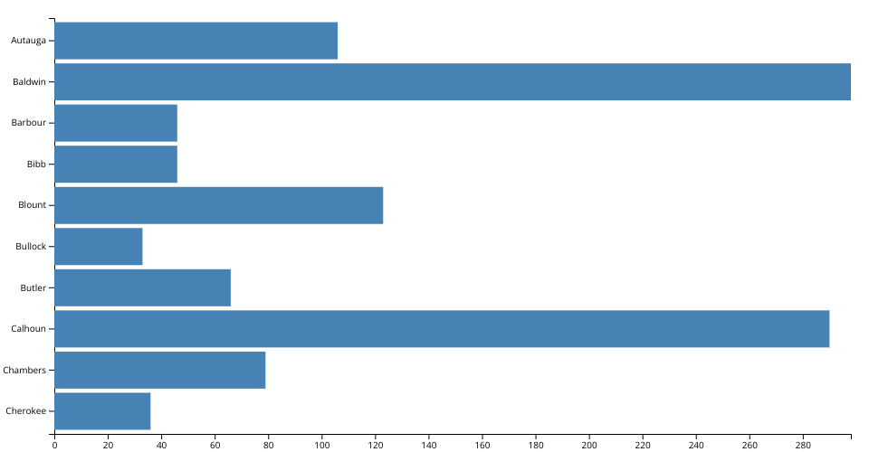
This is an example visualization desgined for the COVID-19 dataset by New York Times. The data for confirmed deaths in the first 10 rows of the dataset corresponding to these 10 counties were selected and visualized in the form of a bar chart
Source of data can be found in my data Gist here
MIT Licensed