
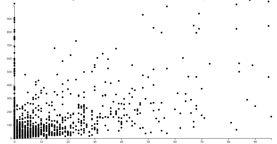
The visualization is a scatter plot of New York Times COVID-19 datasets. Each point represents probable deaths and the confirmed deaths that corresponds to x-axis and y-axis respectively
Source of data can be found in my Gist here
MIT Licensed
The visualization is a scatter plot of New York Times COVID-19 datasets. Each point represents probable deaths and the confirmed deaths that corresponds to x-axis and y-axis respectively
Source of data can be found in my Gist here