
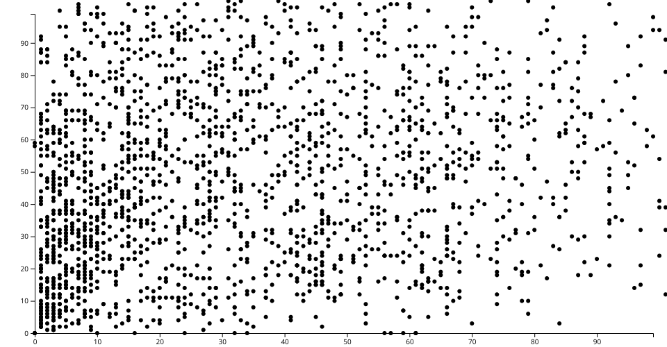
The visualization is a scatter plot of ATP match stats in 2015. Each point represents winner's world ranking and the loser's world ranking that corresponds to x-axis and y-axis respectively
Source of data can be found in my Gist here
MIT Licensed
The visualization is a scatter plot of ATP match stats in 2015. Each point represents winner's world ranking and the loser's world ranking that corresponds to x-axis and y-axis respectively
Source of data can be found in my Gist here