
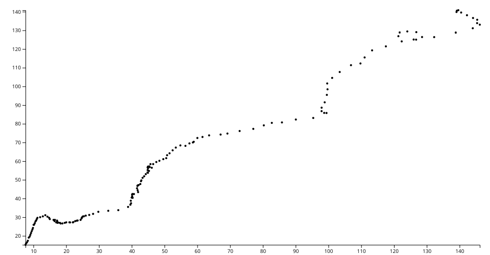
The visualization is a scatter plot of OCED datasets. Each point represents Austria and Belgium hosuing prices that corresponds to x-axis and y-axis respectively from each quarter of the year range starting from 1975 to 2012.
Source of data can be found in my Gist here
MIT Licensed