Forked and authored by Daniel Ribaudo.
This is an iterated version of my project. Because I received no feedback from students at the time I made it, I simply made several of the improvements I had listed as "Next steps"
The data visualized comes from this gist: Video Game Sales
Within this dataset, there is a listing of video game sales per country. Each video game listed is labelled with a genre, year, publisher, and platform.
Description:
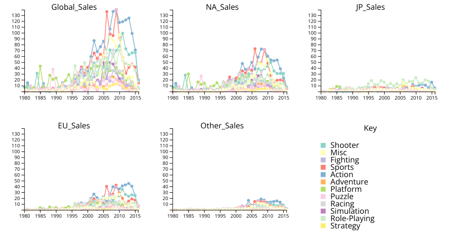
Each chart is sales for each genre of video game plotted against time. The first chart is global sales, the second is North America, third is Japan, fourth is the EU, and finally all other sales. A user may click on the graph to form a crosshair on their cursor. This functionality more easily allows points to be compared across charts.
The key visually maps colors to each genre. Hovering over text within the key highlights the corresponding lines/circles by making them much thicker. Clicking on the next hides/shows the lines/circles corresponding to that genre.
On the technical side, the data aggregation is only done once, allowing points/graphs to be rendered much more quickly after the initial calculation.
Titles are at the top of each graph to show what sales they correspond to within the data.
Description (New Changes):
The user may now pan and zoom within a graph. Doing so affects all other multiples. When clicked, the lines appear in the correct relative position.
When highlighted, a line now comes to the top of the z ordering and gains a black border to distinguish it. This trick is done via having two lines with no opacity above the regular line. When a category is highlighted, these lines both become visible. There are two lines above the original to fix issues with the zordering and blend mode. Blend mode was added (and can still be adjusted) to prevent the effects of occlusion. Perhaps a lighter line opacity can be used instead of a blend mode.
The initial stroke with was adjusted to be smaller to better distinguish between lines, though this is still hard.
Next steps:
- Scale the line and circle width with the current zoom (!Important!)
- Ensure the axes are always in view
- Toggle graphs on and off
- Use different data (in the form of a drop down menu)
- Refactor the code into modules and add more comments
- Fix the color palette so that the yellow color is more readable (!Important!)
- Reset zoom / pan button