A visualization constructed using the d3.js.
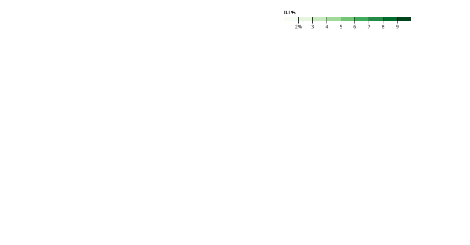
This visualization tries to show the US map by states. The color will be mapped to the ILI Total or ILI percentage values for each state at a given week of a year. The values can be accumulated by time to show monthly or yearly results when needed.
By showing such map and provided interactions to change to a given year at a given week, we can answer questions about the Flu activities at a certain time frame cross all states in US and quickly spot the concentration geographically. Further by introducing the animation of the map, we can visualizting the time variations for the entire dataset.
The visual is not yet complete, therefore, the stateILI.tsv as the input is currently a fake dataset. It should be derived from the original data.
This approach seems to have more code and is likely to take longer time to develop. But it also has the advantage of having more controls at hand. If the Vega-Lite approach has some challenges, I will try to move on with this one. Present issues: the map size seems to be not easy to control and therefore it is not fitting the frame well.
See Data on Gist: ILINet Flu Surveillance Data
The original data comes from the CDC FluView Interactive