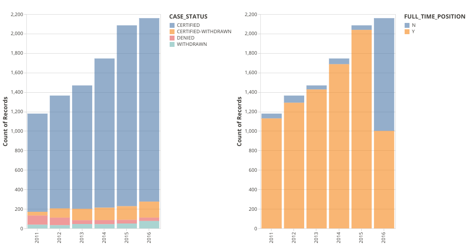
This visualization shows the H1_B visa dataset. My sketch is I want to capture the changes along with time. In this visualization. I checked the total number of petition, the different case status, the number of part time and full time candidates petitions along with years.
The first plot uses a stacked barchart to show the number of petition of visa along with year. Different color means different status.
The second plot shows the number of petition of visa along with year. Orange color means candidates have a full time job. Blue color means candidates have a part time job.
Subplot is inspired by Yu Zhang's method.
MIT Licensed