🌍 Public
Task8_Turorial 4
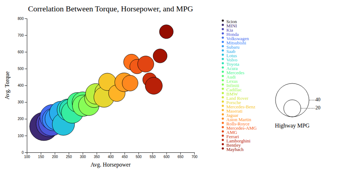
This interactive bubble chart shows the correlation between average horsepower, torque, and highway MPG for various car makes. Each circle’s position encodes horsepower on the x-axis and torque on the y-axis, while its radius and color represent highway MPG and car brand, respectively. The chart is rendered as SVG with D3 v7, using `d3.scaleLinear` for axes and bubble size, `d3.scaleOrdinal` for color, and `d3.axisBottom` and `d3.axisLeft` for ticks. A tooltip displays the car make on hover, and legends annotate bubble size and brand colors. Data comes from a CSV file.
AI-generated descriptionMIT Licensed




Comments
Sign in to join the discussion.