🌍 Public
Fork of Food Production Stacked Bar Chart
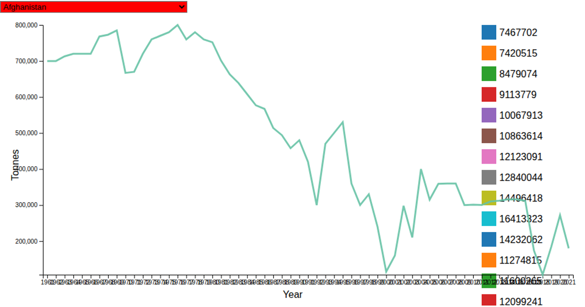
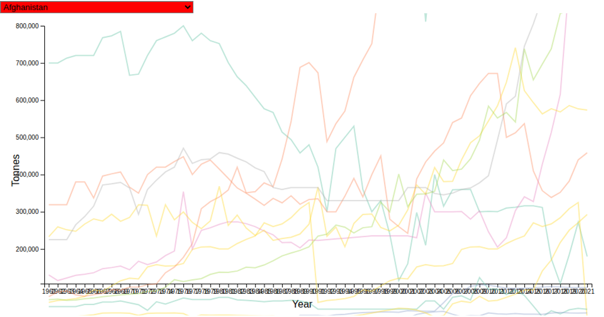
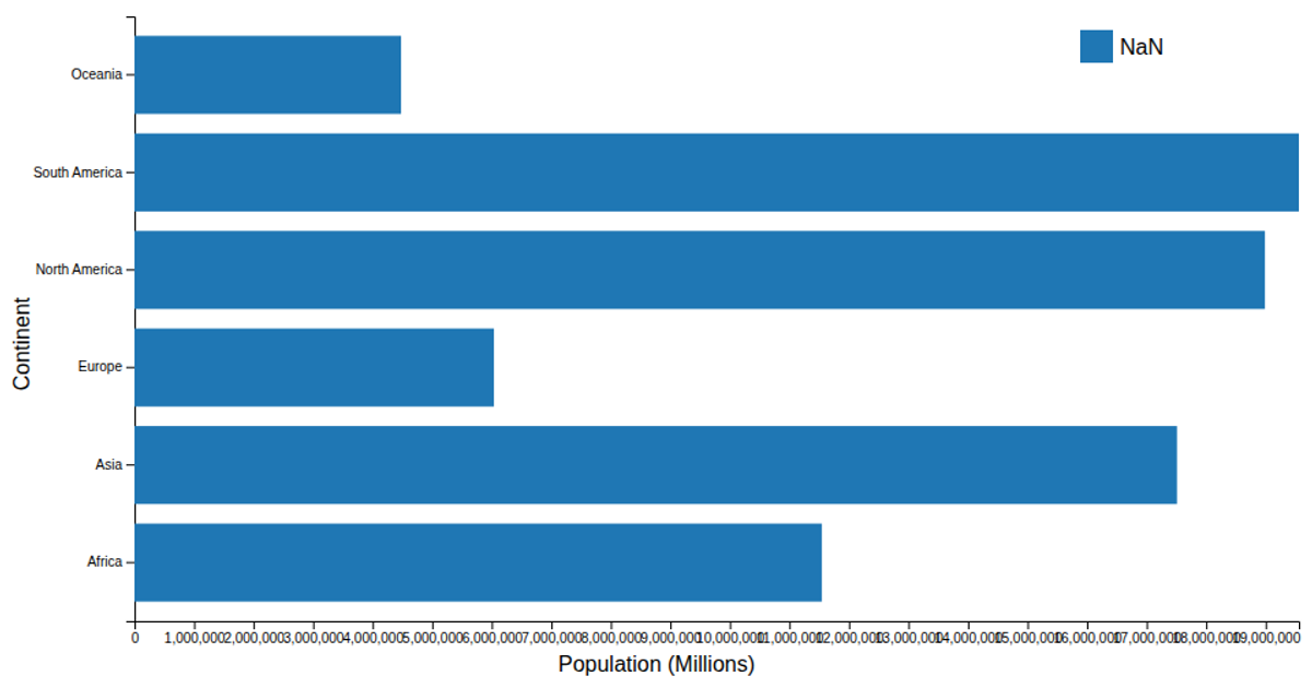
This stacked bar chart breaks down estimated food production by tonnage across the seven continents for 2021, based on data from the World Food Production dataset. Hovering over a food category in the color legend highlights that segment across all bars while dimming others. The visualization uses d3.stack, scaleBand, scaleLinear, and scaleOrdinal to structure the bars, with the colorLegend module managing interactive highlighting and fade effects.
AI-generated descriptionStacked bars showing estimated food production breakdown of the continents. Based on an example from the tutorial
https://www.kaggle.com/datasets/rafsunahmad/world-food-production
https://raw.githubusercontent.com/lukesavoie/dataviz/main/world%20food%20production.csv loaded and parsed as CSV.
MIT Licensed




Comments
Sign in to join the discussion.