🌍 Public
Line Graph
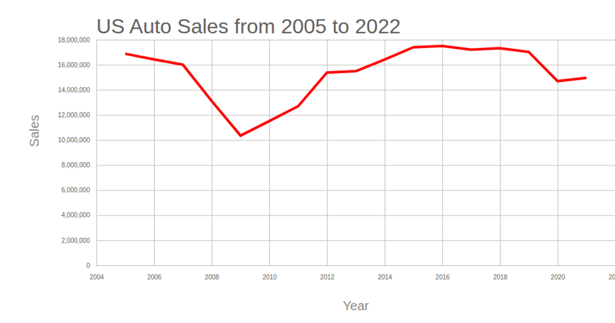
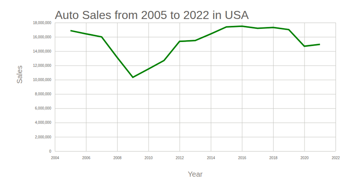
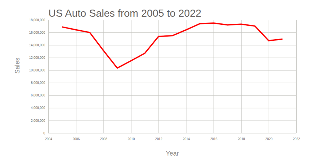
This line graph displays annual auto sales in the USA from 2022, using a time-based x-axis for years and a linear y-axis for total sales. The visualization is rendered as an SVG using d3.v5, with scales created via `scaleTime` and `scaleLinear`, and axes generated through `axisBottom` and `axisLeft`. The data is loaded from a CSV file using `d3.csv`, and the line path is drawn with `d3.line`.
AI-generated descriptionMIT Licensed





Comments
Sign in to join the discussion.