🌍 Public
Fork of Migrant Deaths Linked Views with Fast Brushing
BBrettell
Last edited Nov 26, 2021
Created on Nov 26, 2021
Forked from Migrant Deaths Linked Views with Fast Brushing
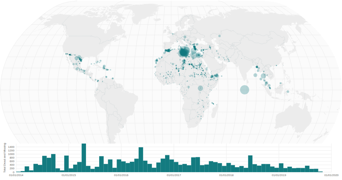
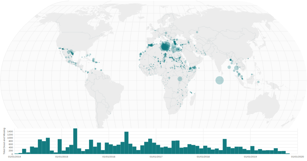
A choropleth-style bubble map renders global migrant deaths as circles sized by total dead and missing, alongside a date histogram that filters the map via brushed time ranges. The visualization uses React's `useMemo` for performance, D3 v5's `geoNaturalEarth1` projection and `geoPath` for the map, and `brushX` with `select` for interactive filtering. Data comes from a Missing Migrants CSV, with country boundaries from the World Atlas TopoJSON.
AI-generated descriptionA world map showing cities with population greater than 50,000. City data from Simplemaps: World Cities Database.
Country boundaries from World Atlas TopoJSON, polished for visual style, including graticules.
This iteration is optimized for performance using React's useMemo hook.
MIT Licensed




Comments
Sign in to join the discussion.