🌍 Public
sekhar que3
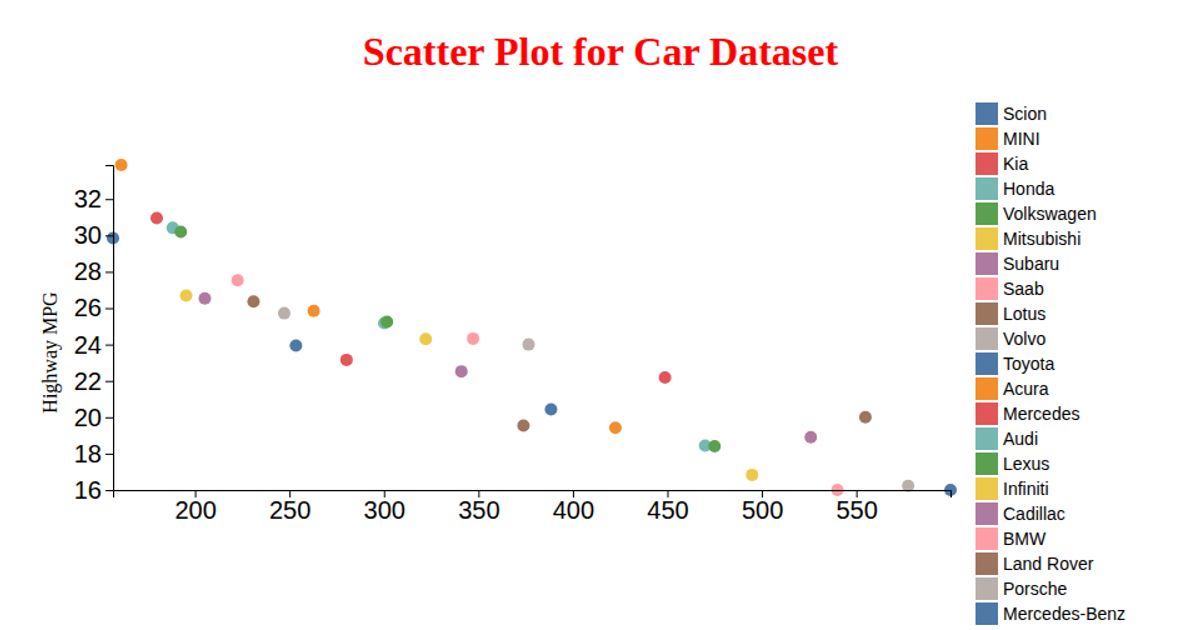
This scatter plot visualizes a car dataset, mapping horsepower on the x-axis against highway MPG on the y-axis, with each point colored by car make. It loads CSV data via `d3.csv`, uses `scaleLinear` for both axes, and applies `scaleOrdinal` with `schemeTableau10` for categorical color encoding. Circles are rendered in an SVG canvas, with axes generated using `axisLeft` and `axisBottom`, plus a legend built from the color scale’s domain. The visualization demonstrates D3 v6 data loading, scaling, and SVG rendering.
AI-generated descriptionAn example showing the capabilities of VizHub:
- Loads D3 via UNPKG.
- Demonstrates use of
importfrom"d3". - Demonstrates use of
importfrom local ES6 modules.
MIT Licensed




Comments
Sign in to join the discussion.