🌍 Public
Fork of Missing Migrants Date Histogram
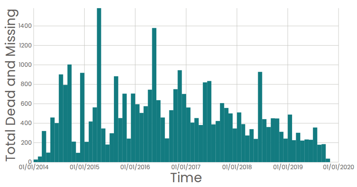
This visualization shows a date histogram of the total dead and missing migrants per month, using the Missing Migrants Dataset. The chart renders SVG rectangles via React components, with axes built from custom `AxisBottom` and `AxisLeft` components that use D3 scales. Data is loaded with D3’s `csv` function, then binned by month using `d3.bin` and aggregated with `d3.sum`. Hovering reveals exact totals through native SVG `<title>` tooltips.
AI-generated descriptionA date histogram showing the sum total dead and missing migrants for each month.
Data from the Missing Migrants Dataset.
MIT Licensed



Comments
Sign in to join the discussion.