Activity6_Task_2
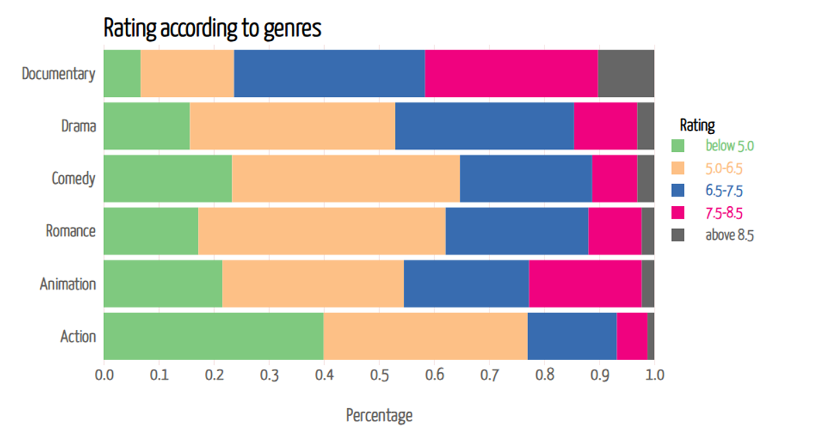
This stacked bar chart shows the effect of genre on movie ratings, where each bar represents a genre and is segmented by rating level, with hover tooltips revealing precise percentages totaling 100%. Built with D3 v7, the visualization uses `d3.csv` to load data and `d3.stack` to compute stacked segments, rendering rectangles with `d3.scaleBand` for the x-axis and `d3.scaleLinear` for the y-axis, while `d3.scaleOrdinal` applies color categories. Axes are generated via `d3.axisBottom` and `d3.axisLeft`, and SVG output is styled with external CSS fonts.
AI-generated descriptionThe impact of genre on movie ratings
This stacked bar chart gives the percentage of each rating level within different movie genres. The aim is to show the impact of genre on movie ratings. When the mouse hovers over each bar, you can see pop-ups of accurate percentage of each rating level within each genre. Total percentage is 1, representing 100%.



Comments
Sign in to join the discussion.