🌍 Public
activity6_Task3.1
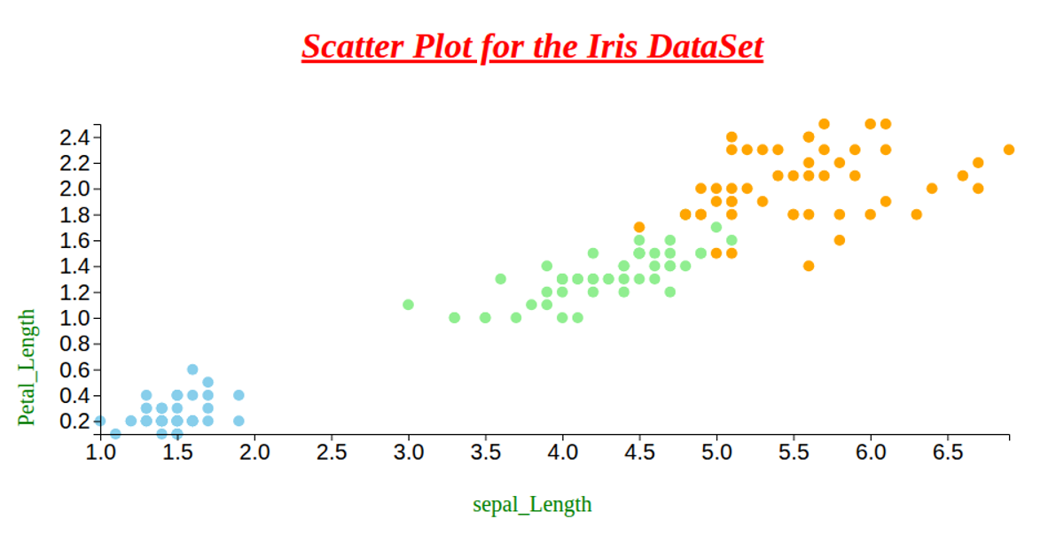
This scatter plot visualizes the relationship between petal length and petal width for synthetic flower data, with each circle colored by species (florida, tropica, montana) using a d3.scaleOrdinal color scale. The chart uses d3.dsv to load tab-separated data from a hosted CSV file, then maps the numeric attributes to a 960x600 SVG canvas via d3.scaleLinear scales for the x and y axes. Axis labels are added using d3.axisBottom and d3.axisLeft, and circles are rendered with a fixed radius and 80% opacity.
AI-generated descriptionMIT Licensed



Comments
Sign in to join the discussion.