🌍 Public
Activity6_Task4
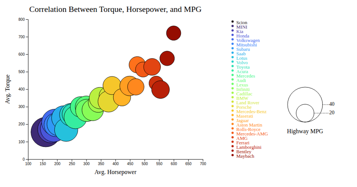
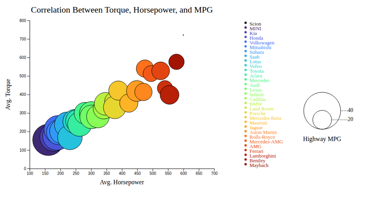
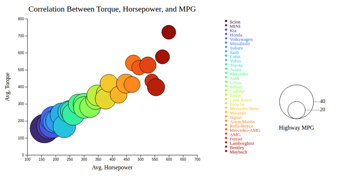
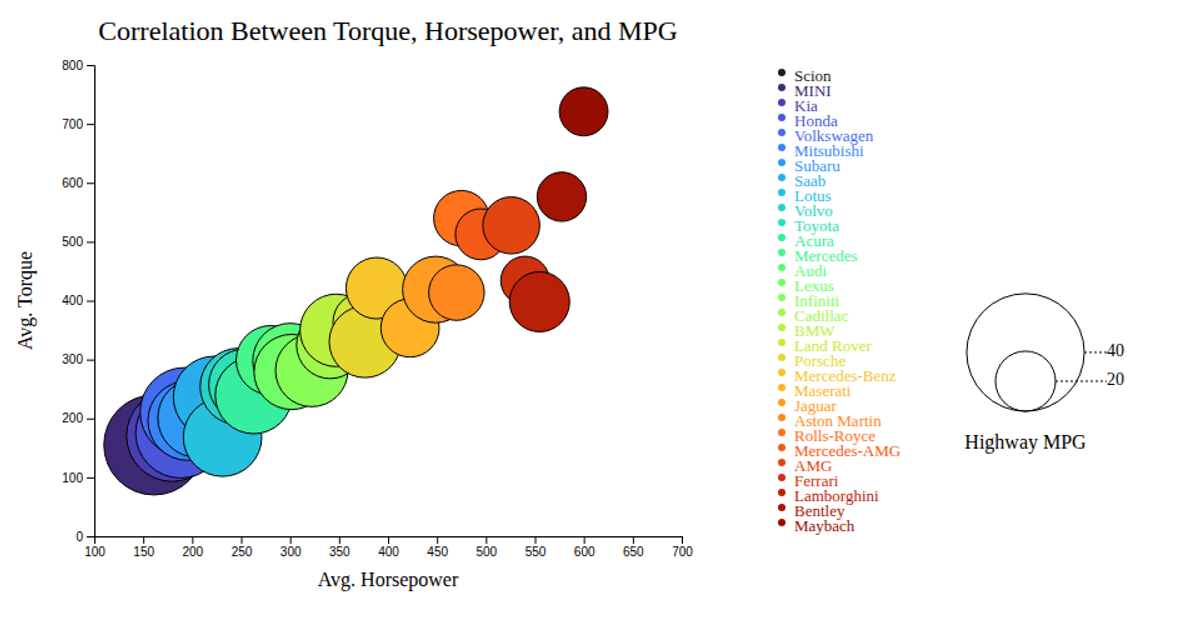
This bubble chart displays the correlation between average horsepower, torque, and highway MPG across 31 car makes. Each circle’s position encodes horsepower (x-axis) and torque (y-axis), while its radius represents highway MPG and its color distinguishes the manufacturer. The SVG is built with D3 v7, using linear scales, an ordinal color scale with `interpolateTurbo`, and interactive tooltips that follow mouse events. A legend explains both bubble size and color encoding. Data is loaded from a CSV file.
AI-generated descriptionMIT Licensed




Comments
Sign in to join the discussion.