🌍 Public
Activity 7_Task 4
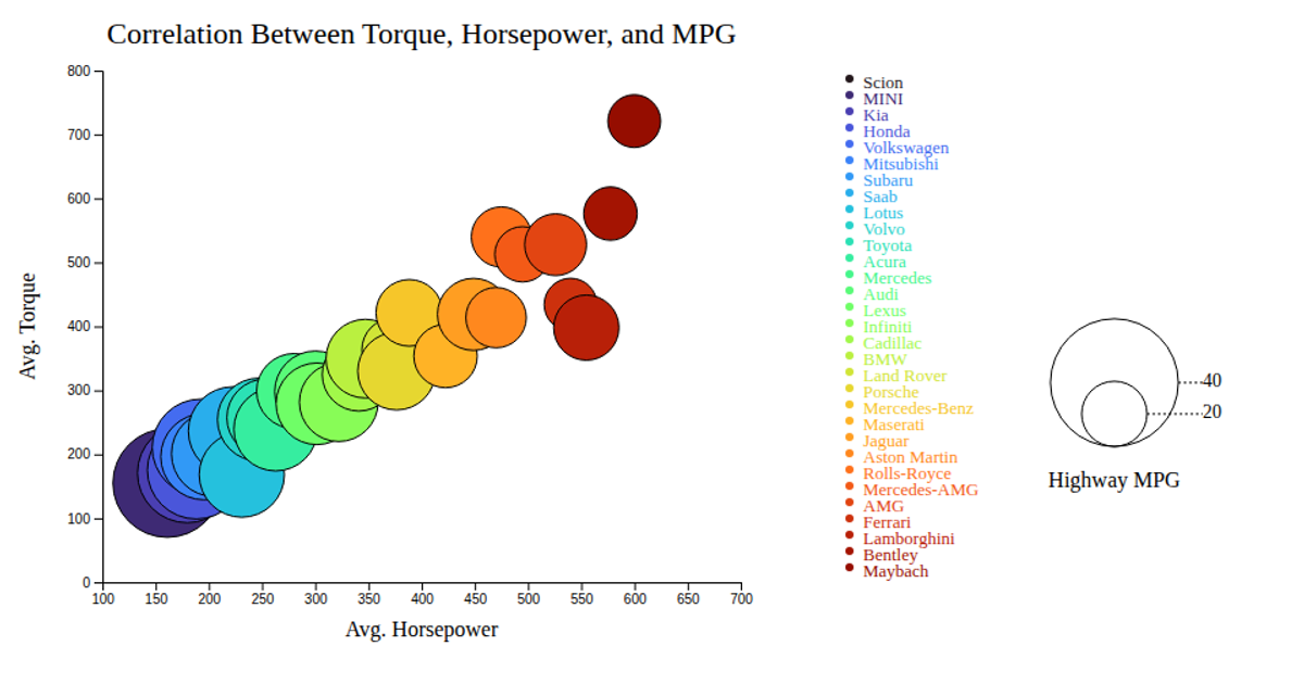
This bubble chart visualizes the correlation between average horsepower, torque, and highway MPG for various car makes. Each circle’s position encodes engine performance values, while its size represents fuel efficiency. The visualization uses D3 v7’s `scaleLinear`, `scaleOrdinal`, and `interpolateTurbo` for color mapping, along with SVG rendering and hover tooltips. Data from `bubblechart.csv` is loaded via `d3.csv`, and the chart includes axes, circle legend for MPG, and categorical color legend.
AI-generated descriptionAn example showing the capabilities of VizHub:
- Loads D3 via UNPKG.
- Demonstrates use of
importfrom"d3". - Demonstrates use of
importfrom local ES6 modules.
MIT Licensed



Comments
Sign in to join the discussion.