🌍 Public
Scatter Plot with Color Legend
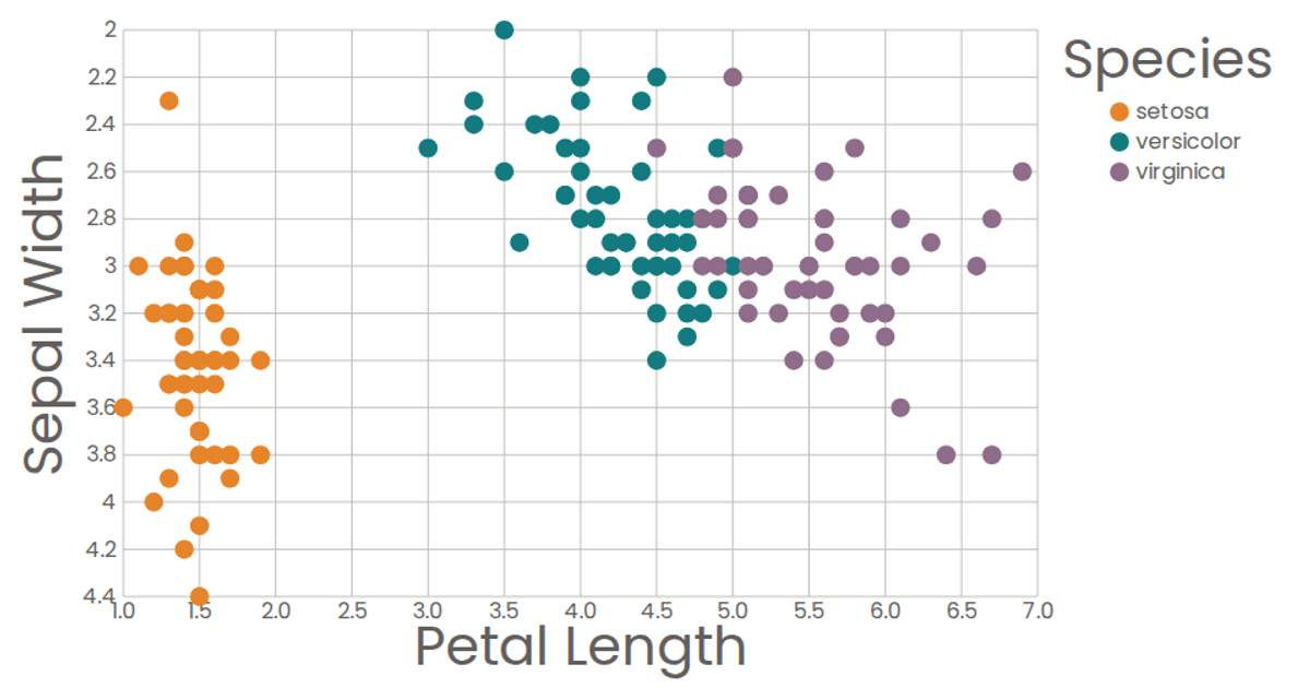
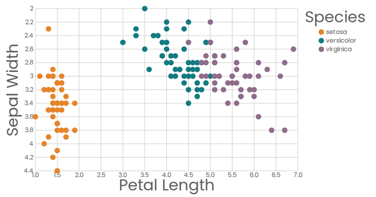
This example visualizes the classic Iris dataset using a scatter plot of petal length versus sepal width, with points colored by species according to a color legend. Selecting a legend item dims all other points and restores full opacity to the matching species. Built with React and D3 v5, it uses `scaleLinear`, `scaleOrdinal`, and `extent` to compute scales, while custom React components render axes, marks, and the interactive legend as SVG. The data loads as CSV via D3’s `csv` function.
AI-generated descriptionA scatter plot of The Iris Dataset with color legend.
MIT Licensed





Comments
Sign in to join the discussion.