🌍 Public
Activity6 Question 1.2
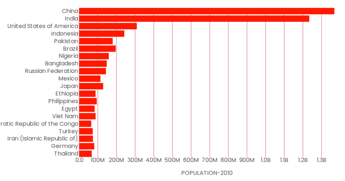
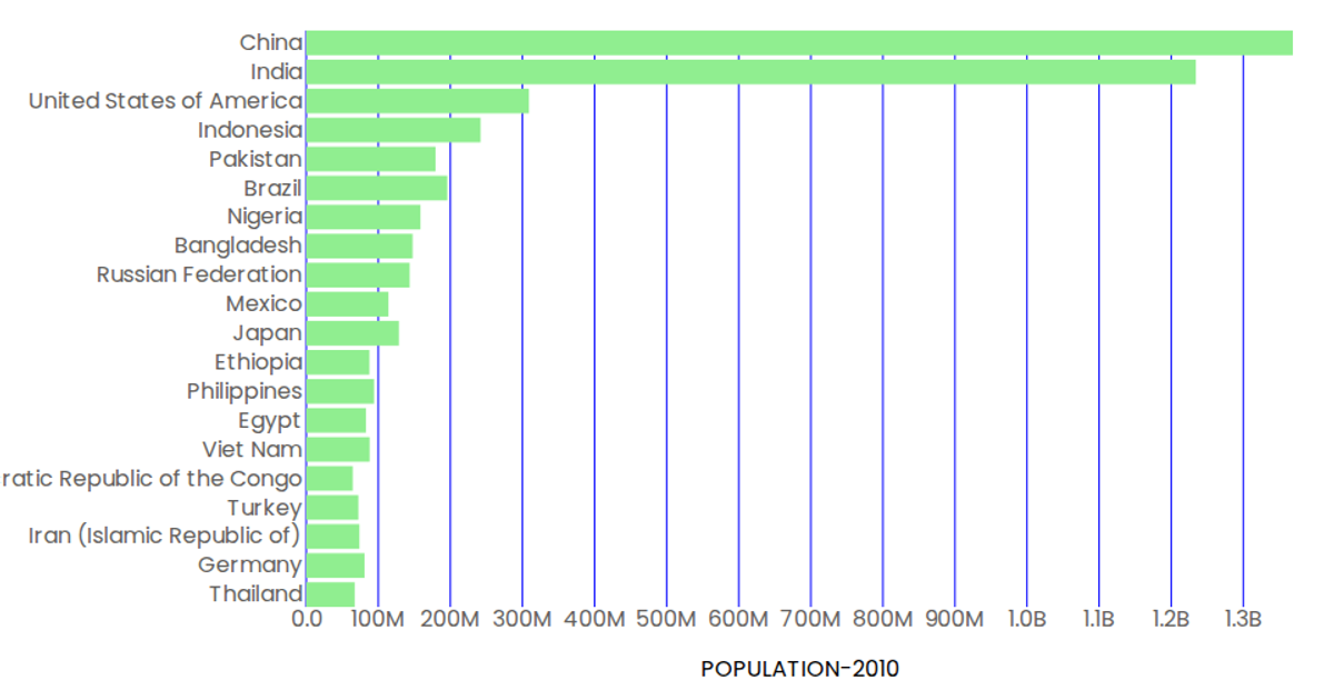
This example shows the populations of 30 countries in 2010 using a horizontal bar chart. The chart uses React functional components with D3 scales to map country names to the y-axis and population values to the x-axis. Bars are rendered as SVG rectangles with hover effects, and axis labels are formatted using D3’s `format` function to display values in billions. Data is loaded asynchronously from a CSV file using D3’s `csv` method. The code includes custom axis components for the bottom and left sides.
AI-generated descriptionMIT Licensed




Comments
Sign in to join the discussion.