🌍 Public
Comparing Star Wars starships
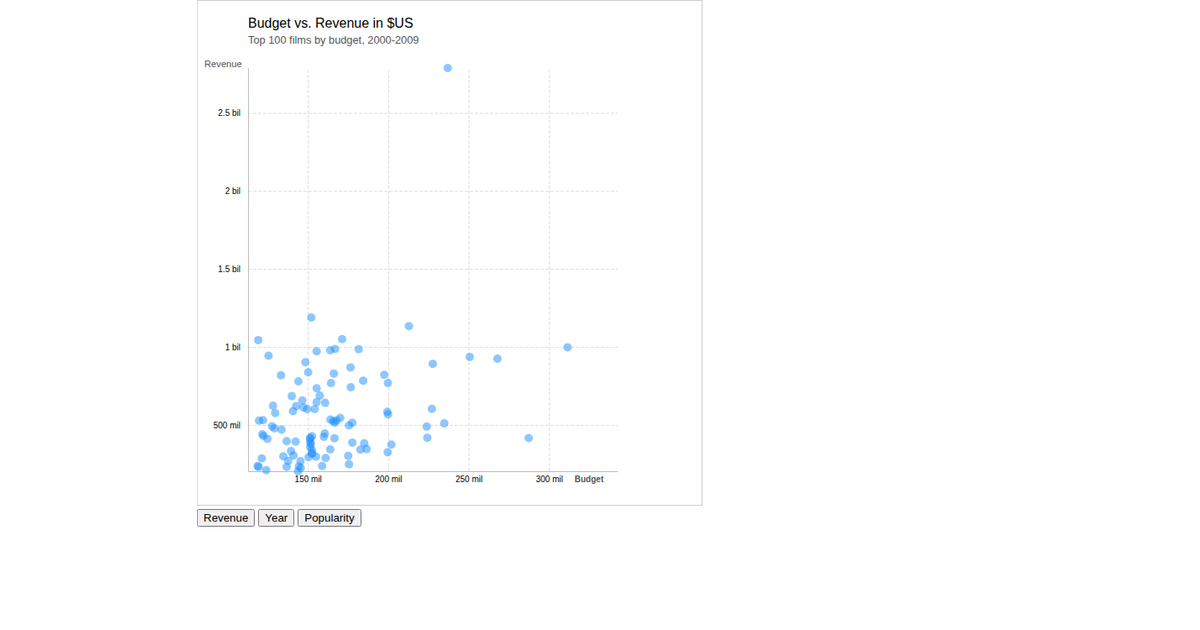
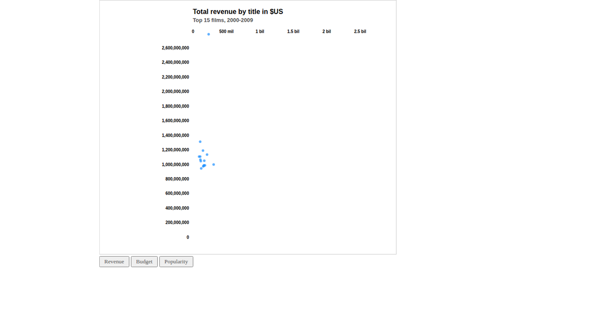
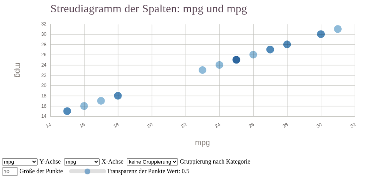
This interactive scatterplot compares Star Wars starships by cost, length, and crew, using the SWAPI dataset. Users can dynamically select which numeric attribute maps to the x-axis, y-axis, and circle size, with axes and legend labels updating accordingly. A checkbox filters out expensive capital ships, and a smooth D3 transition animates the repositioning of circles when a new column is selected. The visualization is built with D3 v5 and rendered as an SVG, featuring a size legend for the third variable.
AI-generated descriptionMIT Licensed





Comments
Sign in to join the discussion.