🌍 Public
T3
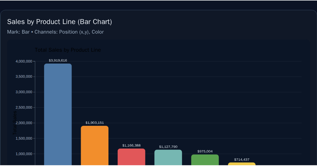
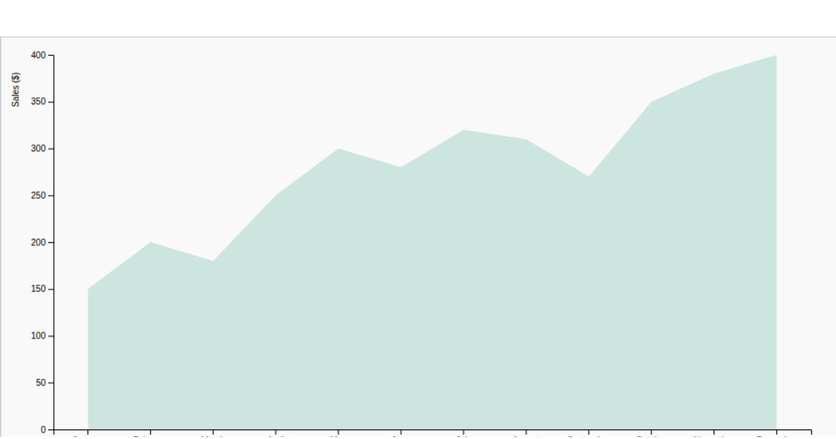
This example visualizes average sales amounts by sales channel, with a bar chart comparing categories from an Amazon Sale Report dataset loaded via `d3.csv`. The code computes group means using `d3.rollups` and `d3.mean`, then renders the bars with SVG rectangles. It uses `d3.scaleBand` for the x-axis, `d3.scaleLinear` for the y-axis, and includes rotated axis labels and a title. Data is fetched from a GitHub raw URL, and the chart is built with D3 v7 within an 800x400 pixel container.
AI-generated descriptionAn example showing the capabilities of VizHub:
- Loads D3 via UNPKG.
- Demonstrates use of
importfrom"d3". - Demonstrates use of
importfrom local ES6 modules.
MIT Licensed






Comments
Sign in to join the discussion.