🌍 Public
t3
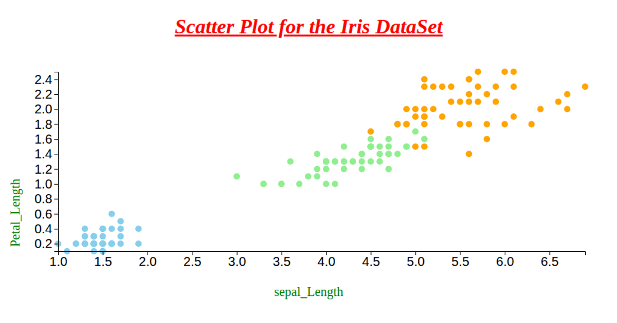
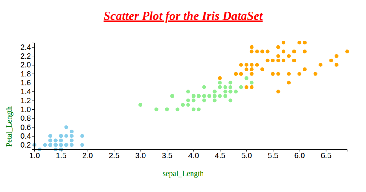
This scatter plot visualizes the IRIS dataset, encoding petal length and width along the x- and y-axes while coloring each point by species (setosa, versicolor, virginica) using skyblue, lightgreen, and orange. The code loads CSV data from a GitHub gist via `d3.csv`, uses `d3.scaleLinear` and `d3.extent` to map values, and renders circles in an SVG. Axes are generated with `d3.axisBottom` and `d3.axisLeft`, with rotated, green text labels added manually.
AI-generated descriptionWe are Displaying the IRIS dataset using Scatter plot.
MIT Licensed




Comments
Sign in to join the discussion.