Customizing Axes
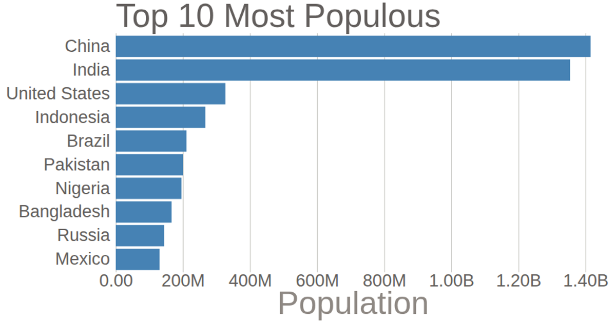
This bar chart displays the population of the top 10 most populous countries, based on 2018 estimates from the United Nations World Population Prospects. It demonstrates customizing D3 axes: the y-axis has its domain line and tick lines removed, while the x-axis uses a tick format function to abbreviate large numbers and adds a custom axis label. The chart uses `d3.csv`, `scaleLinear`, `scaleBand`, `axisBottom`, and `axisLeft`. Population values are multiplied by 1000, and bars are rendered as SVG rectangles with steelblue fill.
AI-generated descriptionThis bar chart shows population of the top 10 most populous countries. The data comes from the year 2018 estimate in United Nations: World Population Prospects 2017. It also demonstrates customization of D3 axes.
See also the first bar chart visualization that this one builds on: Making a Bar Chart.



Comments
Sign in to join the discussion.